Microsoft Edge DevTools receives a UI redesign
![]() 2 min. read
2 min. read
![]() Published on
Published on
Share this article

Improve this guide
Read our disclosure page to find out how can you help MSPoweruser sustain the editorial team Read more
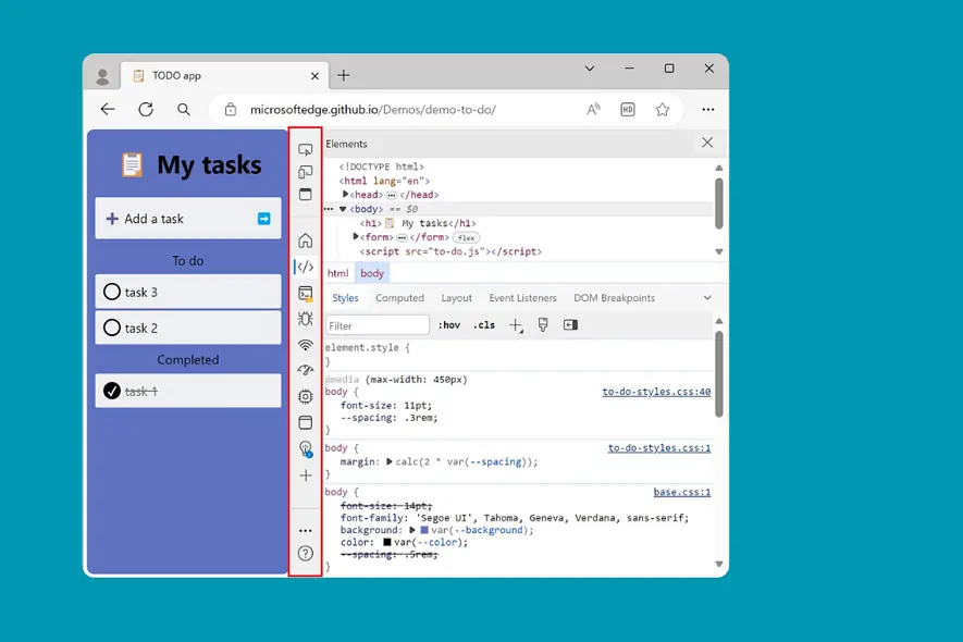
Microsoft has unveiled a comprehensive redesign of its DevTools, which recently got a functionality where Copilot can explain specific lines of code, the built-in tools web developers leverage to debug and inspect websites.
As revealed, the revamped interface prioritizes user-friendliness and efficiency, emphasizing customization, discoverability, and a welcoming experience for novices and seasoned developers.
Here are the main changes:
- Replacing the traditional toolbar, a row of icons representing individual DevTools now occupies the prominent space. This helps in tool identification and organization, enabling users to customize the order and visibility of icons based on their preferences.
- New users are greeted by a revamped Welcome tool with helpful tips and tutorials, easing the learning curve and familiarization process.
- Multitasking is enhanced with the Quick View toolbar, allowing developers to utilize two tools side-by-side simultaneously. The toolbar’s orientation can be horizontal or vertical to best suit workspace preferences.
- The management of tools is made easy through a unified “More tools” button that provides access to all tools in the DevTools arsenal. You can also quickly remove or relocate a tool by right-clicking on its tab or placing it in the Activity Bar.
The redesigned DevTools UI is currently accessible in Microsoft Edge Canary, and Dev builds, with a broader rollout to all users anticipated in the coming months.
More here.