Microsoft announce updates to Fluent Design for developers and users
4 min. read
Published on
Read our disclosure page to find out how can you help MSPoweruser sustain the editorial team Read more
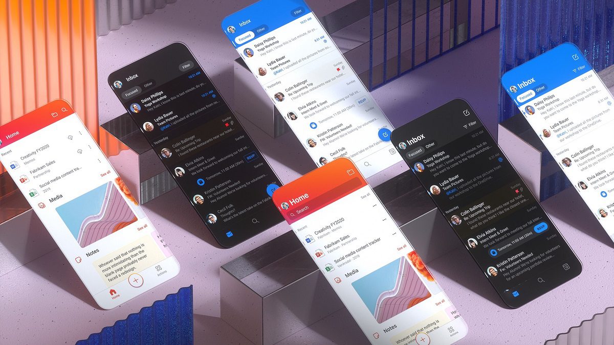
In a blog post, Microsoft has announced new improvements to the Fluent Design experience for developers and users.
The design framework is currently used in apps such as Outlook, Teams and OneDrive, and Microsoft recently announced Fluent UI, unifying their web and mobile UI libraries under a shared charter.
Microsoft has announced an evolution of their developer frameworks, with input from designers, developers, accessibility and internationalization experts, and writers. They have identified areas for improvement, and this year, are aiming to close the gap between design and code, starting with a design token system.
New cross-platform library
Fluent UI is a collection of UX frameworks for creating web and mobile apps that share code, design, and interaction behaviour.
Using components from Microsoft’s Fluent UI React (web), Fluent UI Apple (iOS and macOS), and Fluent UI Android GitHub libraries ensure their Microsoft 365 apps and services remain powerful tools while feeling more intuitive and coherent across platforms. With the addition of their new Fluent UI React Native library, Microsoft is creating cross-platform components — making it easier for JavaScript developers to deliver experiences across devices to customers more quickly.
For developers building native Windows experiences, WinUI continues to embody the Fluent Design System.
Native to each device, still uniquely Fluent
Microsoft says they believe their Fluent Design elements, such as the custom navigation bar, makes apps feel uniquely Fluent and coherent across platforms while still fitting into native iOS and Android platforms.
Delivering a more coherent, productive experience
Using the same design language for all Microsoft 365 apps also allows users to easily move from one app to another and have a pretty good idea how to navigate it and get things done. The same goes for platforms. Microsoft notes that people often start a task on one device and finish it from another, so creating coherent experiences across platforms reduces cognitive overload for their customers.
Modernizing Microsoft’s theming architecture
Currently, Microsoft products all use disconnected theming approaches.
Microsoft is looking to modernize its theming architecture to create a scalable, future-proof design system. Future themes will make it easier and faster to update design values across all platforms using a common theming infrastructure, taxonomy, and centralized set of cross-platform style libraries across Microsoft frameworks.
To do this, they are moving away from fixed values and toward more agnostic variables, or design tokens. Design tokens define the visual attributes of a UI surface and link design to code using a common syntax. Centralized style libraries, accessible by both design and development tools, will serve as the place to make updates without having to revise coded components.
To expose the power of tokens and mitigate their complexity, Microsoft is explored ways to meet designers inside their existing design tools. Since most designers at Microsoft use Figma, Microsoft searched for ways to extend the capabilities of that tool to support their design tokens with little to no friction.
The result was a Figma plug-in which will replace the native properties panel. Instead of creating designs by assigning colours or stroke-widths via the properties panel, designers will assign tokens to their layers. They can remap these tokens to a different value if necessary, allowing any changes to propagate throughout the design. Microsoft is also building the development pipeline that translates these design tokens into platform-specific values.
Together, these efforts help distribute design values directly into the codebase, offering product designers and developers a completely integrated design-to-code workflow.
This has a knock-on effect for end-users. People will be able to easily opt-in to theming libraries for apps they create. They could then customize these libraries to better reflect their product’s brand or service and feel more coherent across the ecosystem.
https://vimeo.com/417688279
Developers looking for a design system that respects native look and feel and includes UX components hundreds of developers and millions of consumers use every day, can give Fluent a try here. Both internal and external developers can dive into the Fluent UI Microsoft GitHub organization and start creating.
Microsoft will talk more about Fluent UI and their future aspirations for the Fluent Design System at the online Microsoft Build 2020 conference on May 19-20 which is free and open to all.


User forum
0 messages