Latest Canary Build for Google Chrome brings major design changes for Desktop users
1 min. read
Published on
Read our disclosure page to find out how can you help MSPoweruser sustain the editorial team Read more
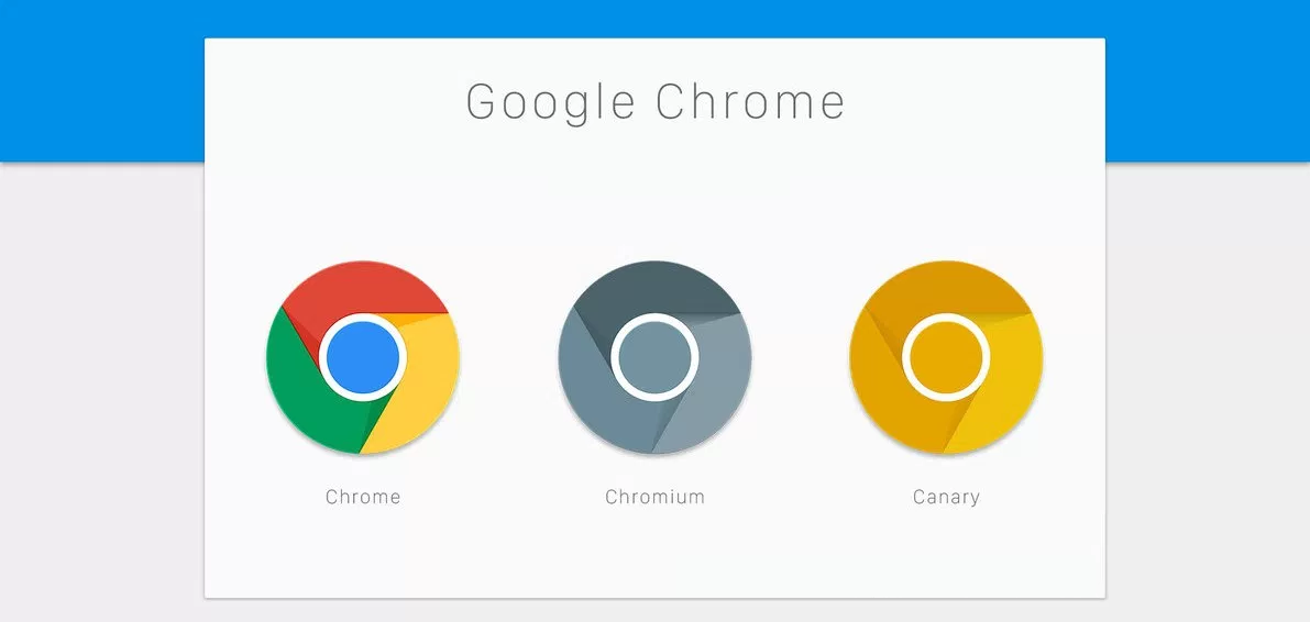

Google is rolling out a new update for Chrome browser. The update is just for the Canary or Nightly app and brings a new UI to the browser. The new design looks more like the Material design and is similar to what we have seen on Android.
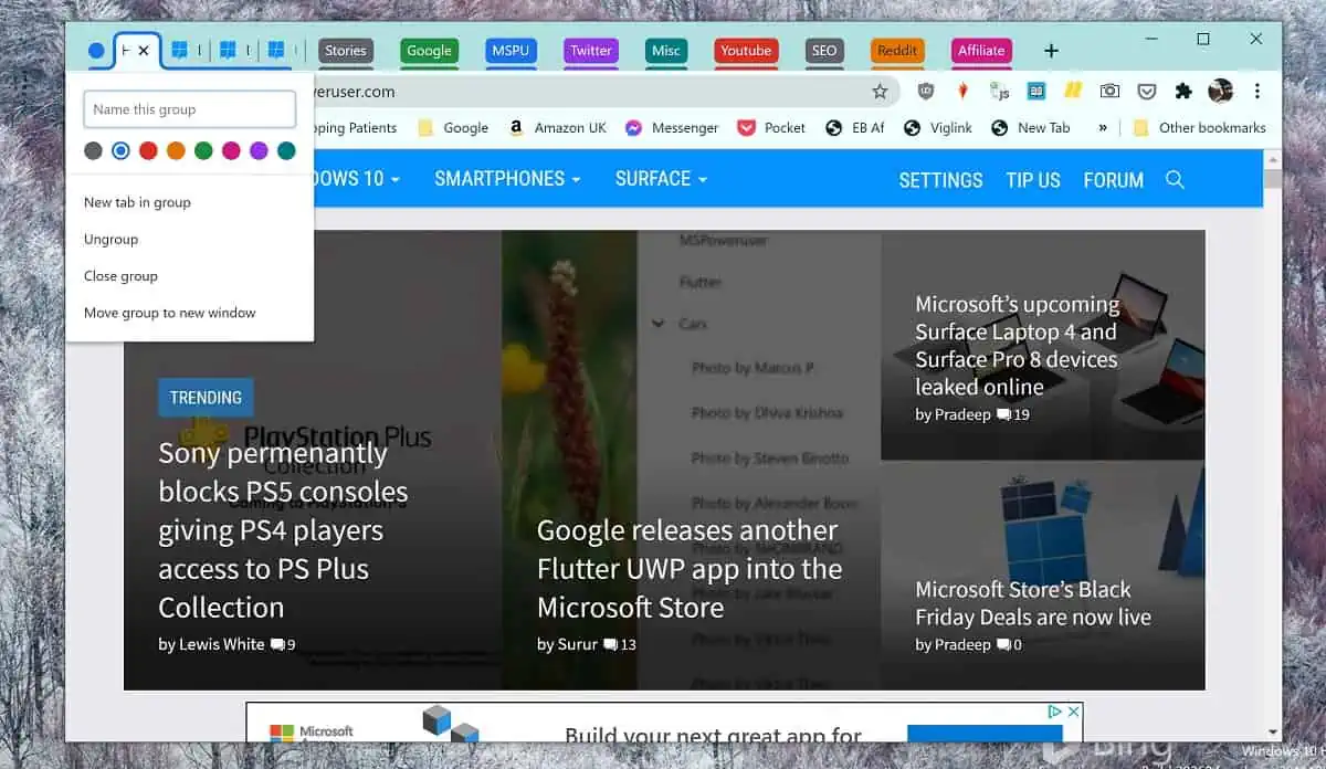
The new update adds a brand new tab design interface which looks much modern than the existing design. The new version has also moved the profile icon. Now, the profile icon will be visible at all times and is placed beside the address bar. Google has also improved the drop-down menu in the address bar and it now looks better than the existing design. The tabs also have the same colour as the tab bar and they blend into the bar.

The new UI is currently available for Canary Build users. Google might change things before rolling out the final build. For now, if you want to try out the new design then you can head to Google Chrome’s Canary page and download the update. However, do know that Canary builds are extremely unstable and are not recommended for daily use.
Via: GSMArena





User forum
0 messages