Designer envisions a Windows Explorer with Fluent Design and it actually looks good
1 min. read
Updated on
Read our disclosure page to find out how can you help MSPoweruser sustain the editorial team Read more
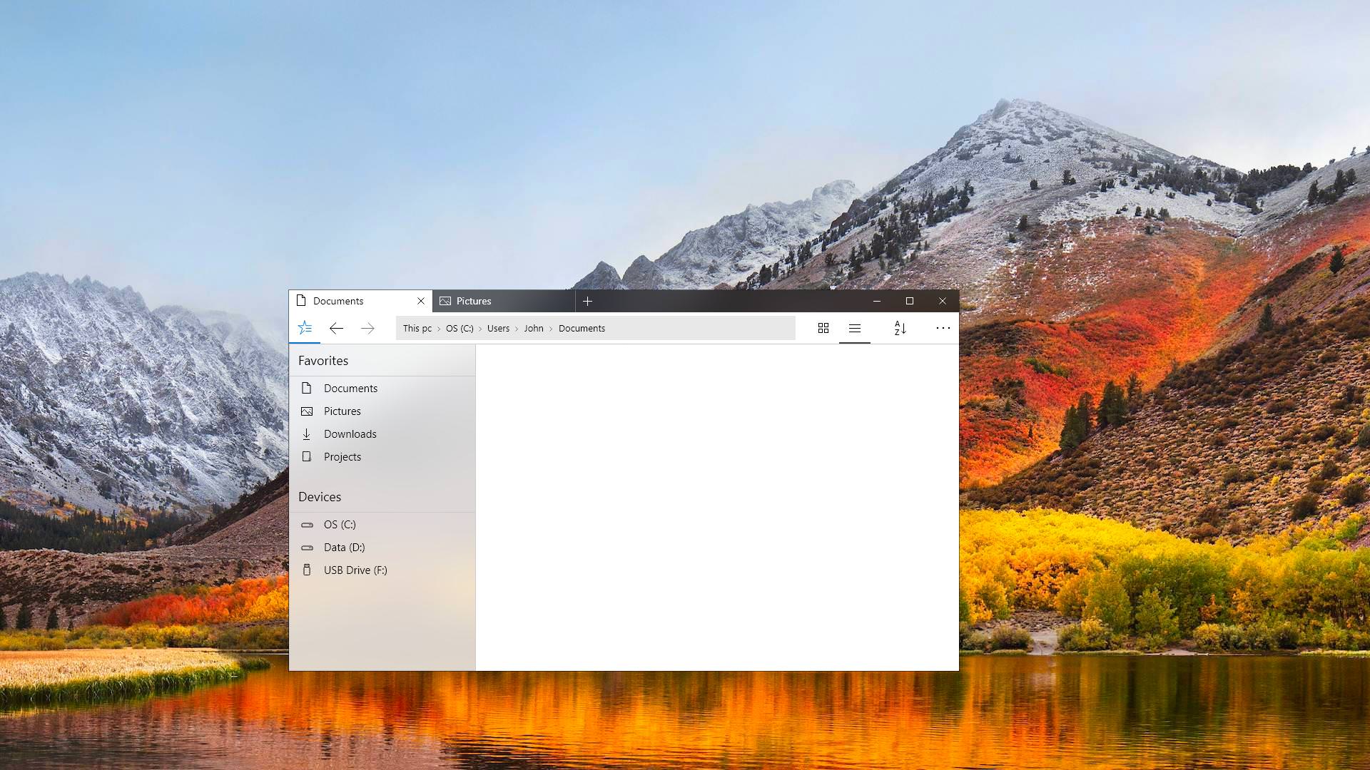
Despite Microsoft redoing Windows many times over the years, there is one fundamental Windows application which has largely gone untouched, except possibly for the addition of the infamous ribbon UI.
The Windows File Explorer would be easily recognizable to someone who time-travelled from 2001, but designer InfernoGems wants to change that, producing a design which is at once familiar but also much more attractive, finger-friendly and more fitting to our browser-centric work style these days.
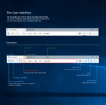
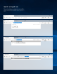
See his ideas in the gallery below.
What do our readers think of the new look? Let us know below.








User forum
0 messages