A History of Windows Phone: The life and death of Microsoft's mobile platform
It was February 2010, Apple was continuing its dominance of the mobile market, Android was beginning to take off and Microsoft had no horse in the smartphone race. Technically that’s not quite right, Microsoft had two horses, Windows Mobile and the Kin. However, WM had not seen an update in a while and had an interface that may as well have been command line for regular consumers. In addition to this, the Kin was widely regarded as a punchline to an unfunny joke and was quick scrapped.
In any case, Microsoft needed a stake of the modern smartphone market and needed it fast. So it happened at MWC 2010 in Barcelona, the first iteration of Windows Phone as we know it was announced.
Windows Phone 7 series- The First Step
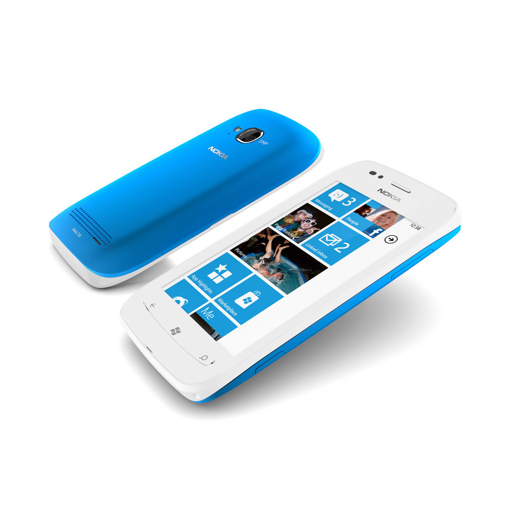
Windows Phone 7 was widely regarded as a great base for an OS platform. It was different from all other OS’s in so many ways. The most visible of which was the start screen.
Typical smartphones home screens revolved around a row of icons, iOS, Android, WebOS and BlackBerry OS7. In this way, Windows Phone was a massive departure from the norm. Featuring a 4 x 2 layout of solid coloured live tiles, the OS was visually different and starkly polarizing. Hence while some reviewers praised the live tiles and start screen, others viewed it as confusing and disorienting. Another pain point was the usefulness of tiles on the start screen. The Windows Phone start screen was intended as a dashboard of sorts, meant to lay emphasis on a glance and go philosophy where a user could scan the tiles and then plunge directly into the apps that were most important to them. In practice, this was a little complex with only the native app tiles having only full live tile functionality and third party applications being handicapped in that area.
Another area of difference was the presence of hubs. Windows Phone hubs offered a degree of integration which provided a good baseline that could was built upon in the next few releases before being overhauled in 8.1 Blue. The initial hubs were the people hub, Zune, games, photo hubs. The People Hub was the Windows Phone equivalent to the contacts app, with a huge difference. Rather than merely focusing on phone number and email address, Windows Phone 7.0 focused on social aspects of these relationships. Once you signed up with your Windows Live mail, Google Mail or Facebook account, you quickly get an influx of contacts from all these accounts which could be linked together for a cohesive social profile. This hub pulled in pictures, posts on social media, messaging history and others. The main page of the hub consisted of three screens, the first showing your contacts, the other being a what’s new feed that aggregated posts on social media and the last being a panel that showed you your recently viewed contacts. The people hub remains one of the most fantastic aspects of Windows Phone till date, and further improvements to it over the years cement this reputation.
The Zune hub was a one stop hub for all your media content. It handled the music player, video player, FM Radio and Podcasts for the OS. Its live tile was one of the most live live tiles in Windows phone 7, complete with an animated logo and a similarly animated visual of the last played artist. These would slowly be removed over the next few iterations of Windows Phone. The hub itself followed the typical hub design with four-five panes of content. Three of which were dedicated to showing recently played media, newly added media and apps which could handle media. The last two were a portal into the areas that handled music/videos and a page which showed new arrivals into the Zune store. Now many users have a love hate relationship with Zune, currently being praised as one of the best creations of Microsoft, it was hated upon its inception as an iTunes-esque piece of software which handled everything sync related like media files and the like as well as OS updates.
Next, one of the most advertised staples of the Windows Phone experience was the Office Hub.
The Office hub was an advertised feature for business users, boasting collaborative features via SharePoint, note taking via OneNote and document editing with Microsoft Word with Excel and PowerPoint along for the ride. This feature was and is still being advertised as real Microsoft Office™, but was anything but at the original release of 7.0. While it was better than nothing, and offered basic functionality, that was all it offered. It couldn’t change fonts, colours were limited to only red, black, orange and green. Fundamental to an office app as well, there was no copy and paste functionality as well. In addition, the ability to access password protected docs was absent as well, limiting its enterprise usefulness. PowerPoint lacked the ability to create .ppt and .pptx files (admittedly niche in appeal). It was an excellent viewer of slideshows, which is far more useful on a mobile device. OneNote was also present, but lacked pen and ink support and was really more of a simple editor with the ability to add pictures, audio and other attachments. To enable syncing, you could activate your Windows Live OneDrive account, which allowed the user to start working on one machine and carry of over to the next machine, like what Apple advertises continuity and handoff to be.
The final two hubs were the games and pictures hubs, they were pretty simple and straightforward but played well with the integrated philosophy of Windows Phone. The Pictures hub managed photos, and not just locally stored photos, but those which were stored on the cloud and social networking websites. Windows Phone users who began using the platform with 8.1 may not be familiar with the old photo hub, it aggregated photo apps and editing apps along with a “What’s New” feed of photos from your social media contacts. It had a live tile which cycled through all your photos or a select few, depending on how you configure it.
One issue with this hub approach (and the people hub to some extent) was that it was quite easy to end up with a cluttered “What’s new” feed if you were not careful, and interacting with the photos in the feed was implemented in a clumsy fashion with the user being kicked over to the browser often.
Last but not least, the Xbox hub managed all your games and gaming apps. It was a typical hub app with one pane listing all apps it managed, another pane for your Xbox live avatar and so on.
One problem with the Xbox live feature here wasn’t the fault of the OS, it was a problem that still afflicts the platform till today. Microsoft and developers (more on that below). For the hub to be useful, there had to be more than a few Xbox live games present on the platform, unfortunately, Windows phone did not have too many games which made use of the feature at launch, crippling it. Microsoft’s policies for Xbox live enabled games did not help either, with many developers being put through a bit of stress before they could get their apps certified. Today, the program is on life support with only a few Xbox live enabled games coming through.
Apart from the hubs feature, the rest of the OS was standard. There was the Windows Phone marketplace, which was a one stop shop for apps, music and videos. There was also a standard dialler, a maps application powered by Bing Maps, a basic camera and email app and other staples of a modern OS. Notifications were handled via toasts and the live tile system and there were several hero devices from Samsung, HTC, Dell and LG including the HTC Trophy and the Samsung Omnia. Nokia was not yet a partner of Microsoft.

Now with a huge number of devices, a well-received OS and the backing of a huge company like Microsoft, one would expect Windows Phone to have caught on quite quickly. Several certainly did think it would displace Android and iOS, what held Windows Phone back was a combination of two things, mentioned above. Microsoft and developers. Microsoft had developed a very locked down platform with only a bit of wriggle room for devs and users. Certain types of apps like video editing apps and proper music players couldn’t be created using the available APIs and multitasking was extremely limited. Like Apple, Microsoft had shipped a smartphone platform that as fast, fluid and functional but limited in its functionality. Unlike the iPhone, Microsoft had many competitors.
They needed to get updates out and fast.
The first update came in the second year of Windows Phone (2011), codenamed NoDo, this update brought copy and paste to Windows Phone 7, improved the multitasking and fixed several bugs in the OS. It was a useful update, but began a worrying trend for Microsoft. While Android received major updates frequently and iOS received a major update every year with minor updates being issued in between, Microsoft was so far behind they needed to adopt the Android mentally rather than the iOS one in other to catch up.
It seemed that they knew this when rumours of another update, Mango as well as stirrings of Apollo began to hit the internet. These updates would be THE updates to propel the OS above other OS’s. As this rumour gained steam, another event created waves in the Windows phone world.
Nokia was going to join the Windows Phone bandwagon, ditching Symbian and Meego for Microsoft. The implications of this were tremendous, Nokia’s hardware and brand recognition would push Windows Phone into the mainstream, arguably, and one could say that it has with the name Lumia now being almost synonymous with Windows Phone.
Windows Phone 7.5 – 500 new Mangoes
A year after Microsoft unveiled its original Windows Phone 7 project, the first major new update was released. Windows Phone 7.5 Mango and its 500 new features was announced in May 2011 by Steve Ballmer. This update was the last Windows Phone 7 update for several users and added many staples of the Windows Phone experience.
First of all, behind the scenes, Microsoft enabled support for new hardware and direct X Graphics. Dual Core CPUs were not enabled then, the reason given by Microsoft was that the costs outweighed the gains, but with modern Windows Phones standardized on quad-core CPUs, it is more likely that the Windows CE based OS could not support it without a lot of work. This would require manpower that the firm was not willing to divert from its new project, Apollo, the next step for Windows Phone.
Live tiles were resurrected in this update. This isn’t to say that they were dead previously, it’s just that the older version of WP7 limited the ability of live tiles to update dynamically. Mango allowed apps to update more often as well as enabled deep linking. That is to say, one could pin multiple sections of an app to the start screen. Like OneNote notebooks, Evernote pages and others. The start screen would become more alive than it was before in this update.
Speaking of which, one of the complaints about the original Windows Phone software was about how difficult it was for you to get to your apps via the app list. Without pinning that specific app to the start screen, one would have to hunt and peck around the app list. Microsoft listened to user feedback and provided a jumplist feature that activated when there were 45 or more apps installed. You could then tap on a letter and jumps to apps that you needed to access.
Microsoft also enhanced the messaging functionality here. Where the messaging app was just a simple text and SMS app, after Mango, it became a full-fledged messaging hub with access to both Facebook and Windows messenger. You could fire off a message on Facebook, go off-line and then switch to text seamlessly. It was a useful and powerful tool for communication, especially for a people focused OS like Windows Phone.
On that note, the people hub was also updated and received twitter integration to add to it’s already useful Facebook integration which provided all the basics. You could post to Twitter from the Me tile, view your notifications in the What’s new pane and directly share your photos to twitter albeit using a OneDrive link.
Now with all these social networks, one might think the Windows Phone People hub would become cluttered with updates from here, there and everywhere. Not so, Microsoft had added new features that would allow you to filter your What’s new feed as well as creating groups so you could track certain groups of people like your family and coworkers.
It was also in this update that Microsoft fleshed out the native Bing app, adding in a music identification feature, a QR code scanner and Local scout, an app which was built off Bing’s mapping functionality that would present you recommendations for nearby POIs like restaurants and the like.
The email app was similarly enhanced and refined, previously on Windows Phone managing multiple accounts required each account to have its own tile, which could lead to a cluttered start screen for some. Mango enabled linked inbox functionality, allowing the user to link multiple inboxes into one email hub. It also added support for threaded emails, a shocking oversight for the company behind Outlook. Messaging and emails weren’t the only additions to the OS. Multitasking was also massively improved. Windows Phone multitasking had been poor and temperamental with no way to quickly switch apps besides jumping to the start screen and selecting the app again. Mango fixed this by implementing two features. Fast App resume and a new multitasking view accessed by holding down the back button. Firstly, fast app resume changed the behaviour of apps which were updated to support it. Previously when you swapped away from Windows store apps, you had to restart them from start. Now, the apps assumed a saved state and remained in memory for quite a while, allowing one to switch back through the new cards based multitasking view. For instance, if one was viewing a twitter app and switched apps or locked the screen, whereas the old WP 7.0 apps would have to reload from scratch and lose your place in the app, upon being updated for fast app resume the app would retain your position on the timeline. This vastly improved the user experience and allowed apps to work almost as well as their Android and iOS versions.
Speaking of apps, there was a huge elephant on the room there. When Windows Phone was a fledgling operating system, it was all well and good that it had few apps, yet a year later in the lifecycle of the OS and the number of apps in the store were still shockingly low with many apps being non-existent or poor caricatures of their Android and iOS selves.
In addition to this, while Microsoft had announced several new features for Windows Phone 7.5, it lacked several more features. From little conveniences like locking screen rotation, to issues like creating and editing music players as well as hardware limitations. These frustrations when added to the app gap issue slowly began to cut down the optimism that reviewers and enthusiasts initially had for Windows Phone.On the hardware side, Nokia had finally began to make some Windows phone devices, including the Nokia Lumias 900 and 800, it wasn’t nearly enough to turn the tide. 2011 was the year of the iPhone 4S and Siri, by the time Mango’s new features had reached the vast majority of Windows Phone users, it had already fallen behind once more.
Windows Phone 7 would receive two more updates, Tango and 7.8. It would be rendered obsolete by the upcoming Windows Phone 8.The first of the two updates was Tango, this update was mainly used to enable lower end devices with 800 MHz processors and 256 megabytes of RAM. Nokia quickly took advantage of this and released the Lumias 710, 610 and 510. All low to mid-range devices to round out its stable of Lumia devices, a trend that would repeat itself over and over again until the name Lumia would become synonymous with Windows Phone.
The final update for Windows Phone 7 would be Windows Phone 7.8, this would bring the UI changes like the increased number of accent colours and new tile sizes from Windows Phone 8.0 to Windows Phone 7. Its roll out was a disaster as many carriers and OEMs declined to update their phones, and several phones which did get the update became bug-ridden. Eventually, Microsoft stopped talking about it and Windows Phone 7 was relegated to the past. An interim OS which had captured the interest of the people for a time, but failed to hold their attention.
Windows Phone 8(Apollo) – A Huge Sidegrade.
In 2012, Microsoft introduced the world to Windows Phone 8. For Windows enthusiasts it was both exciting and disheartening. Exciting in that it represented a new paradigm for Windows where the phone and the desktop OS were moving much closer together. This unification came at a terrible cost however. As we mentioned earlier, the Windows Phone 7 series was discontinued with no upgrade path to Windows Phone 8. Especially affected were people who bought the then just released Nokia Lumia 900, it was had excellent hardware but was saddled with crippled software. Microsoft attributed this stare of events to kernel changes and hardware incompatibility in an attempt to deflect criticism. The spectre of this decision still haunts the company today with constant reassurance being needed for each progressive software update.
Windows Phone 8 advanced the Windows Phone platform in several ways. First of all, it added support for hardware features such as an SD card, NFC, HD screens and higher storage requirements (7.X devices were capped at 16 GB). This allowed OEM’s to launch devices such as the HTC 8X, the Samsung Ativ S and the Lumia 920. Each device boasting up to date hardware specs and unique designs.
Software wise, Windows Phone 8’s most visible change was the start screen. It eliminated the gutters on the start screen, allowing the tiles to cover up all the visible space. There was also more customization added here, while Windows Phone 7 had allowed you to move your tiles around and change their colour to a limited palette, 8 allowed you to resize your app tiles, whether built-in or third-party. There were three sizes which provided a different experience with the smallest tile size offering merely an icon view, the medium tile showing moderate information and the wide tile being especially useful for live information previews for apps like IM and weather apps. Microsoft also added a few more accent colours bringing up the total number of available colours to 20 and an optional one which could be configured by an OEM or Carrier (Verizon red and Nokia blue for example).
The UI also underwent a subtle redesign with all tiles and icons becoming flat and angular, best viewed in the Office App and OneDrive tiles.
Microsoft expanded the Xbox integration from the games hub to all entertainment related hubs on the phone, this included the Music and Videos hub. Zune was killed off here and replaced with the Music + Videos hub which ran on an Xbox Music backend. However, not all functionality here was carried over with syncing being degraded and the ability to rent or buy videos being stripped completely. In addition to all these woes, the hub lagged noticeably on low end hardware until GDR 3.
The Zune desktop tool was rendered useless for WP8 devices with a new sync told being released. Unfortunately, as with all things related to the Zune transition, the new software client was clunky and inefficient with the much lambasted Zune suddenly becoming loved by fans after its demise.
The Games hub received a redesign, a new green and gray colour scheme to match the new music hub. Beyond that, its functionality remained mostly intact.
Microsoft added two family oriented features here, kid’s corner and family rooms. Kid’s corner was marketed as a semi-locked down customizable area of the phone were you could create an alternate environment for children. In practice, you could make use of this as a handy guest feature for handing out your phone to others to use for whatever reason.
The second feature was the rooms feature, if you had several members of your family using Windows Phone, you could add them to your family room and share calendars, notes as well as group chat. It would’ve been a lovely feature if Windows Phones were more ubiquitous. Unfortunately, the relative unpopularity of Windows Phone hamstrung this feature for most users.
Microsoft’s answer to Passbook also shipped with Windows Phone 8’s wallet app. The Wallet app stored your payment details like Paypal and debit and credit cards, it also allowed users to store cards like club cards and membership cards. It’s criminally underused feature was also its most powerful, it allowed you to make NFC payments provide you had a compatible secure sim card. The implementation of this feature was left to the carriers who for the most part neglected it. Effectively rendering it useless.
Other than that, the Wallet was a pretty good passbook replacement, with third-party apps even offering ways to convert Passbook .pkpass files to.mswallet files.
Windows Phone 8 introduced Internet Explorer 10 to the platform. While the app itself was great for browsing the internet and being standards complaint, the mobile web had been optimized for Android and iOS’s more dominant webkit standard. Windows Phone did not support webkit, this made several websites render poorly in the browser (as well as locked Windows Phone users out of any future Kik messenger updates). Tabbed browsing was a chore for most with only six tabs being supported. HTML5 video was not supported either with the OS having to download and play videos using the inbuilt video functionality, this resulted in an embarrassing fiasco between Microsoft and Google about a YouTube app eventually.
All in all, the browsing experience on Windows Phone 8 was mediocre, neither here nor there.
The stock Camera app for Windows Phone (Users of a HTC, Samsung or Nokia phone can make use of the OEM camera app) received a UI change. Options like flash that were previously hidden in the overflow menu were dragged out and now placed front and centre. The largest update was the addition of a lenses feature which allowed apps with camera features to register themselves as such and be launched from the camera app. A nice bit of integration that many apps including Twitter, Vine and CNN (But strangely not Instagram) took advantage of.
The other miscellaneous improvements include visual tweaks to the Office hub. OneNote was broken out of the hub to become its own app and OneDrive received further integration with the OS. Maps could now be downloaded for offline use, saving data for many users.
As Windows Phone was a fairly locked down OS, it was imperative that everything just worked as the user couldn’t tinker to fix minor errors. The OS had a major problem in the form of storage management. When Windows Phones were used, the OS would cache files from apps and pictures that were backed up to OneDrive and not delete them. Eventually the phone would fill up and be rendered unusable till a hard reset was triggered. This was a problem especially on handsets like the HTC 8S and the Lumia 8XX and below which all had paltry amounts of storage that were easily consumed. OEMs would issue updates to enable better storage management but the problem would not be solved till the Windows Phone 8.1 update.
Windows Phone 8 was a continuation of the Windows Phone 7 story, while there were huge under the hood changes, for most users, the experience was fundamentally the same. Not only that, the OS still lacked features like a notification centre, support for manipulation of video files and hardware diversity. Even Nokia who tried to diversify the OS via hardware selection, ended up struggling against Windows Phone’s hardware limits and ended up having to release three variants of the 920 (928/925/1020). The app story was still abysmal upon launch, several apps were nowhere to be found and developers hadn’t yet begun to develop alternatives yet. On the whole, Windows Phone 8 felt like incomplete, with many good ideas but hamstrung by OS limitations and missing features. Windows Phone 7 had come out two years ago, iOS6 and Android Jellybean had been launched and Windows Phone 8 was still closer, feature-wise, to its predecessor than its competitors. Windows Phone Blue was now “The Update” to bring the platform up to par, but it would not launch for another two years.
The State of the Market
When Windows Phone 7 launched, Microsoft had a whole group of OEMs with devices ready to go, this number fell to four with the launch of Windows Phone 8. Among these four, only Nokia would demonstrate any kind of loyalty towards the OS while the others eventually put out lacklustre and forgettable devices like the Ativ S Neo, the HTC 8XT and Huawei’s phones(forgettable remember?).
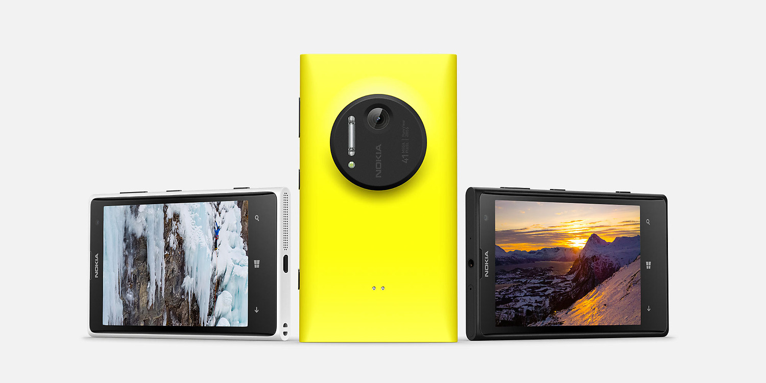
Nokia would grow to dominate Windows Phone market share with and grab attention with devices such as the Lumia 1020 and 925, among others. In 2013, approximately 30 million Lumia devices were sold. These weren’t nearly enough sales and Windows Phone continued to hover at 3 percent of market share worldwide.
In the meantime, Windows Phone 8 received three more updates prior to 8.1.
Portico or why we left cool OS codenames to Nokia
Windows Phone first update, Portico, was a minor update full of minor enhancements and bug fixes. First of all, you could now keep WiFi on when the screen was timed out, a useful feature for saving data and preserving battery life. Staying on the topic of data conservation, you could now choose not to download pictures on IE 10 mobile.
The messaging hub added drafts functionality and the ability to text to multiple recipients. You could also now decline calls with a text.
We should note here that the Window Phone team had now begun to work on the next major update for Windows Phone (8.1), meaning other updates would be similarly bereft of features.
GDR2, we’re doing stuff guys, seriously we are.
The GDR2 update allowed OEMs to set their camera as the default camera app triggered by the camera button and enabled FM Radio as well as CardDAV and CalDAV for those with Google accounts. Data management was improved with the addition of a Data Sense feature which allowed a degree of control over mobile data usage. Users were allowed to set monthly limits, as well as restrict background data depending on user preference.
Update 3…this one’s for the drivers
The third and final update (as well as final change in minor OS nomenclature), this update was the biggest update for Windows Phone 8. It ushered in the Preview for Developers era which allowed enthusiasts early access to OS builds. These were not beta builds but rather the final builds which would be sent to OEMs for bundling with their firmware.
This also enabled new hardware support for quad-core processors and 1080p screens, allowing new flagship devices like the Lumia Icon, 1520 and Samsung Ativ SE.
In terms of consumer facing features, a rotation lock feature was finally added to the settings pane. The storage manager was overhauled, with a new manager allowing users to delete temporary files and manage space. The app switcher was enhanced with an “X” to close apps.
The music hub received a speed boost, improving the experience for users of lower specced handsets.
Microsoft also implemented an instant hotspot feature which allowed Windows devices to remotely activate the hotspot function on a nearby Windows Phone if said device had already been paired by Bluetooth.
For those who made use of Bluetooth accessories with their device, apart from enhancing the Bluetooth functionality, a driving mode was added for those who made use of Bluetooth headsets while driving. This would limit distractions by ignoring calls and texts with an option to send an auto reply. These were all besides the usual big fixes and improvements of course.
Windows Phone 8.1(Blue) – Windows Phone refined
On April 2nd 2014, Microsoft announced Windows Phone 8.1. This was made available in less than two weeks using its Preview for Developers program. This new OS was much more an upgrade than Windows Phone 8, with many user facing features available immediately.
The Windows Phone UI has, on the surface, remained the same in all iterations. Live tiles, a start screen, huge fonts etc. However, it has gotten refinements in each updates. Windows Phone 8 added the ability to resize tiles and more accent colours and now 8.1 would allow the users to make apps which made use of the accent colour transparent when a background image was applied. An elegant parallax scroll was added as well. Still on the Start Screen, Microsoft enabled support for a user configurable third column of tiles.
Another more noticeable change was the size of system fonts. The Blue update reduced the size of the fonts in system apps, making for a cleaner and more information rich UI. It was truly “content before chrome”
Internet Explorer 11 fixed many of the qualms users had with previous versions of it. The UI more or less got out of your way with options like a tab switcher and refresh button being on the toolbar by default. The arbitrary tab limit was removed, with IE now allowing unlimited tabs. A new and highly customizable reading view that stripped pages of all extraneous content was implemented as well.
On the backend, it was now possible for tabs and favourites to sync between computers thanks to Windows Phones improved sync and backup system.
This improved sync and backup system would now allow users to sync more than just settings, with theme colour and Start screen arrangements being synced across as well.
One of the biggest additions to Window Phone in 8.1 was Cortana. Built off Microsoft’s Satori backend and Bing, Cortana was a natural evolution of Windows Phone’s previously limited voice capabilities. She was a personal assistant that handled tasks like reminders, calendar appointments and quiet hours, among others. She lived in the search button, along with a dashboard of your “interests”. She could also be integrated with apps so one could interact with them without opening the app at first. For instance, the command “MixRadio, play me” would trigger an auto-generated playlist on the Nokia Mixradio app.
Where Cortana especially excelled was in contextual tasks, she would know where you lived and how you moved around and remind you to get to work or leave the office with a map that showed the route you could take. Reminders could be set based on person, place or time etc.
For a more detailed look at Cortana, see here
In short, Cortana was one of the best bits of Windows Phone 8.1. Unfortunately she was limited to the US at launch with Microsoft promising to release her to other countries gradually.
Cortanas’s superior organizational abilities were complemented by the addition pf a new notifications area. After running out of time in Windows Phone 8 for a notification centre, Microsoft débuted one for 8.1. This was the Action centre. It was designed to host both the quick settings centre and a notifications area which gathered toasts and other notifications from apps. It was a basic implementation, but in this case, basic was enough.

It was now also easier to take control of your Windows Phone with the new sense apps. Data sense was now installed by default on all Windows Phones and was joined by WiFi Sense, Storage Sense and Battery Saver (Previously referred to as Battery power sense). Storage Sense improved the way the OS handled SD cards, allowing users to now store all apps on the SD card along with media files and downloads.
WiFi sense was built off Data sense and made use of Microsoft‘s catalogue of WiFi networks and connected to trusted WiFi networks automatically. Filling in details without user intervention. It also allowed sharing of WiFi networks between Windows phones without the giver needing to share the access code. Geo fencing allowed WiFi to be enabled by location
Battery Saver handled the background tasks mechanism where you could now disable individual apps or allow them to run in the background even when the battery was low.
The Windows Phone WordFlow keyboard was improved with the addition of shapewriting. You could now swipe over letters in order to type. This, aided by the already excellent keyboard algorithm led to the keyboard being the fastest keyboard in the world for a brief period of time.
Microsoft gave developers a bit more freedom in 8.1, giving them access to a file picker and video library (previously restricted).
We mentioned that devs couldn’t create apps that dealt with videos or music player apps. Well in 8.1 they finally had the necessary APIs, Microsoft’s was beginning to give devs more power, and several apps quickly took advantage of the new APIs.
Unfortunately for us, we can’t always have nice things. The much-loved messaging hub from WP 7.5 mango was killed off and replaced with a barebones messaging app. Microsoft had begun to change its hub based model to an app powered model and the messaging hub was just the first casualty. In 8.1, a new developer tool known as the Social extensibility framework was added, replacing the built in integration, Apps which made use of this framework could appear as targets in the Me tile and sync contacts to the people and photos hub .At the time of writing this only Facebook had made use of this integration and Microsoft limited access to the API to only a few developers, locking out apps like Rudy Huyn’s excellent 6-suite of apps.
The next hubs on the chopping board were the Xbox Music and Games hubs. They were now a trio of store updateable apps and all given a UI makeover, trading the large fonts of WP8 for the more efficient font sizes of Windows Phone 8.1. What is most remarkable about these apps is how they were the worst of the Windows Phone 8.1 experience with threads popping up in Uservoice and enthusiast forum about the abysmal music and games apps.
The Music app was especially bad with many users reporting issues with performance and app crashes. Microsoft acknowledged the issue and admitted the app was released as an “alpha” (direct quote from Joe Belfiore) and issued semi-regular updates for users.
Other miscellaneous improvements were the addition of a weekly view to the Calendar, the addition of a swipe gesture to close apps from the multitasking view, better memory management and better storage management (the other storage issue was fixed).
Conspicuous in its absence here was the Office hub, sans access to the SD card, it went untouched. We understand that Microsoft is testing a new version of its office apps based on the universal app framework. Codenamed Gemini, this should replace or complement the Office hub upon completion.
Windows Phone 8.1 is Windows Phone, refined. In 8.1, apart from adding much-needed features to the OS, Microsoft improved the overall look and feel of Windows Phone. Perhaps if Microsoft had launched 8.1 to begin with, market share would not have remained stagnant.
The OS was accompanied by the elegant Lumia 930 and its smaller brother, the 630 from Nokia. Shortly after, Nokia’s devices and services division would merge with Microsoft and launch three other Lumia devices. HTC returned to Windows Phone with a WP version of its well-received HTC One M8 and Microsoft managed to coax a number of OEMs to join them. All in all, Windows Phone was now facing its best hardware selection since Windows Phone 7.
Update 1 – We’re putting actual features in our GDRs now
Microsoft quickly released an initial update to Windows Phone 8.1, Update 1. This enabled Cortana for the UK and China, with Australia, India and Canada.
Internet Explorer was enhanced with webkit compatibility for websites that didn’t support traditional HTML5 standards.
The OS also gained support for live folders, allowing you to group tiles (not just apps) into folders that would animate provide live information. Remember kid’s corner? Microsoft added app corner to provide a completely locked down mode where your phone could be set to any number of apps and have disabled buttons. In the coming months Microsoft would add voice activated Cortana, a live tile for the battery app, support for more VPN configurations and a mobile data toggle to the OS. There were several other improvement to built in apps and general bug fixes that are so small they don’t merit listing. Suffice to say, Microsoft was now refining the Windows Phone experience.
Update 2 – The Ninja Update
Windows Phone 8.1 Update2 was the update that caught most people by surprise. After being rumoured for launch in October 2014, it was allegedly cancelled and shelved in lieu of the new Windows 10 for phones update(Windows 10 Mobile). However, on March 2 2015 at MWC in Barcelona, WMPU was among the first to discover that the newly announced 640 and 640 XL would ship with Windows Phone 8.1 update 2.
The update brought a few new features to the OS like reset protection, an anti theft feature that prevents your device from being reset by thieves. The troublesome settings menu was also reset and reorganized. Rather than a long scrolling list that was allegedly organized in terms of most used, the new settings menu grouped similar settings under a header and made use of quick jump lists. This new settings menu would eventually be superseded by an the new universal settings menu in Windows 10, but in the meantime, it eliminated a UX pain point for Windows Phone. The next major feature implemented in Windows Phone Update 2 was app permissions. Users could choose which apps could access certain features of the OS like Location, the calendar etc. Interestingly enough, the more advanced Android hadn’t yet gained this feature by the time Update 2 was rolling out, and would not gain it until the release of Android Marshmallow – sometime later this year.
Windows Phone 8.1 Update 2 broke the mold in that it was not accessible by the preview for developers program but was instead rolled out by carriers or accidentally downloaded by users of the Windows Insider program. Not all Windows Phone devices would get it, but Microsoft promised to plan to bring Windows 10 mobile to all Windows Phone 8.1 devices.
Windows 10 mobile – Reaching the Threshold
[Original text here –On September 30th 2014, Microsoft announced Windows 10. What was most notable about this was that Windows 10 was to run on all Microsoft devices, all the way from Lumias and Xbox, to PixelSense and the Internet of things. This was the next generation of Windows Phones. It is bold, mysterious and novel. While Windows Phone today represents about 3 percent of the smartphone market with an install base of about 70 million, Windows dominates the desktop business with about 1 billion users using Windows. What Microsoft hopes to achieve for all its platforms is a continuum of experiences, with its universal app project and several other developer facing features, they hope to attract developers and by extension, consumers. While the Microsoft of old and to some extent the Microsoft of today may have been focused on productivity and office, the present Microsoft recognize that people want to do so much more with their devices. Windows Phone was a backwards implementation of that at first with the extras like UI flourish and design being given more importance than functionality. Microsoft seems to have struck a balance in 8.1 and will carry this goal on to Windows 10.]
Like many parts of Windows 10, Windows Phone 10 – now rebranded as Windows 10 Mobile [silent but implied Edition] was first hinted at at Microsoft’s Windows 10 unveiling back in October 2014. We didn’t know much about the OS, only that Microsoft had planned to launch a set of universal Office apps on it.
The first real unveiling of Windows 10 Mobile was thus at Microsoft’s Windows 10 event held three months later in January followed by a further reveal at Build in May with a final public release planned in October of 2015 with the Lumia Flagship handsets code named Cityman and Talkman.
Like a typical Microsoft Windows Phone update, Windows 10 was not free from it’s share of controversy. First off was a hubbub raised around the update availability to devices. People had speculated that Microsoft was and intriguing, Windows 10 offered a departure from the current iteration of the OS in both increased functionality and a change in the design ethos.
Actually, that is not completely accurate. Windows 10 didn’t offer a drastic shift in design style as much as it did a shift in the application of that style. For instance, despite the addition of hamburger menus and other “un-Metro” things, a Universal Windows app still looks distinct from apps of the other major two OSes, IOS and Android. While Microsoft may have dialled back on the original panaroma look of the OS, the new UI was designed both to accommodate the universal UI paradigm as well as make users of opposing OSes more familiar with Windows Phone and Windows. It is yet unknown as to whether this idea would bear fruit or just render one of the strongest points of Windows Phone- its design – null and void.

In Windows 10 Microsoft would add several powerful new features to extend the OS to make it closer to its desktop counterpart as well as refine and redefine the mobile Windows experience.
Just like Windows Phone 8.1 before it, Windows 10 also included new “Universal apps”. Apps that were designed to run both on Windows and Windows Phone. However, unlike Windows Phone 8.1, Microsoft’s Windows 10 would have truly universal apps. Apps capable of running on Windows Mobile, Windows, Surface Hub, Hololens and the Xbox One platform with the least effort. Apps that make up the core OS of Windows like People, Camera, Photos etc were all redesigned and recreated as Universal apps. This wasn’t new for the Windows desktop as its core apps were already store updateable. For Windows Phone, it was a step towards modularization, which allows Microsoft to update their apps from the store without waiting for new OS updates.
The universal apps did not stop their universality at Windows, Microsoft also created two bridges, Astoria and Islandwood. These two “bridges” were platforms that would allow app developers from Android and iOS to simply port their apps over to Windows Phone with little to no modifications. Candy Crush for Windows Phone was one of the apps created using project Islandwood.
Astoria is the more controversial project of the two. Unlike Project Islandwood which requires devs to turn their iOS apps into Windows apps before they run, Astoria allows Android apps to run directly on the Windows Platform itself through an Android subsystem introduced in Windows 10 Mobile. The emulation was first demo’d at /Build/ which showed an Android app running on Windows 10. While some raised concerns that apps which used Google play services would not work normally, Microsoft quickly assuaged those concerns by showing that thje Google play plugijns could simply be replaced with Microsoft equivalents. On balance, it would be fair to say that while Astoria is a massive and headline grabbing project, Islandwood is the more important project to Microsoft. With Project Islandwood, devs can create universal apps which will run cross platform in line with Microsoft’s new goals for the Windows ecosystem. Astoria apps are more limited in that they can only be run on Windows Mobile and not on the Windows desktop.
In any case, Windows 10 mobile would ship with the following universal apps, People, Messaging, Photos,Groove Music, Film and TV, Settings, Edge, Alarms, Calculator, Xbox, Store, OneNote, Office Mobile, MSN apps, Windows Camera and finally two new apps for keeping users happy, a contact support and getting started app.
One of the first things Microsoft demoed in Windows 10 for Phones was a new messaging app. The new messaging app was Microsoft’s answer to Apple’s iMessage, a ubiquitous messaging service that runs on all Windows 10 devices and integrates itself with SMS. Unlike iMessage, Microsoft was not building yet another messaging service that users would have to sign up to, rather they were built to take advantage of Skype’s backend and servers. What this means is that while Windows 10 devices will be able to communicate seamlessly with each other, non Windows 1 devices like iOS and Android will make use of the Skype app to pull off communication, possibly improving the viability of Skype as a mobile platform. At least that seems to be the plan. While Microsoft is still testing the Skype integration internally, it has yet to release a build capable of running the Skype calling and messaging apps to Windows Insiders
Another of the most important of these new apps were the Office Mobile apps. Previously, Windows Phone in Windows Phone 8 had been the only OS to feature Microsoft Office natively, however with the introduction of Office apps for Android and iOS, Windows Phone now effectively offered the worst Microsoft Office experience. To be honest, it wasn’t just Microsoft’s Office app that was bad, Outlook, OneNote, Skype etc were all better on competing platforms. To make matters worse, Microsoft now began to create an aura of discontent from its most ardent supporters by launching apps and services first on iOS and Android first. To make up for it, Microsoft would attempt to create first class experiences on the Windows 10 platforms. With the Windows 10 Insider Preview for Mobile and Windows 10 for Desktop, Microsoft debuted new Universal Office apps which would make full use of APIs used in Windows 10. Outlook Mail and Calendar replaced the previous Outlook mail and calendar apps, standalone apps for Office (Word, Excel and PowerPoint) replaced the old Office hub and the OneNote app was decoupled from the main OS and made store updateable. For more detail on the Windows 10 experience, see here, here and here.
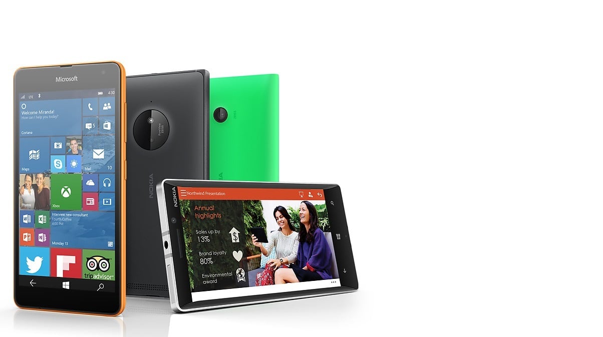
As with every iteration of Windows Phone, the start screen has once more undergone an evolution.
In Windows Phone 8.1 as we detailed above, Microsoft introduced transparent tiles on the start screen. This allowed users to set a background that lay behind the tiles, increasing the personalizability of the OS. In Windows 10, this is taken even further. Now users are allowed to set a background that spans the full width of the start screen, including the app list. Of course, the traditional monochrome start screen still remains, with Microsoft now allowing users to pick a choice of 48 accent colours to theme their devices.
For devices like the Lumia 1520 and 640 XL, Microsoft is offering a show more tiles option that allows up to two wide tiles or four medium tiles on a screen at once. This makes better use of the screen real-estate for phablet devices and allows users to see more apps at a time.
The Action center in Windows 10 mobile was much improved over the action center introduced in Windows Phone 8.1. First of all, the number of toggles available in the action center was raised from 4/5 to 12/15 with one row visible and the others expandable via a toggle.
Microsoft also implemented expandable and actionable notifications via the action center and toasts. Where as previously you were limited to seeing one line of text in the toasts or in the notification centre, Microsoft has improved it so that you can see as many as 5 lines. For some apps you can even action on notifications while still in the action center. Most prominent of this was the new messaging app, which allows you to reply to messages directly from the toast.
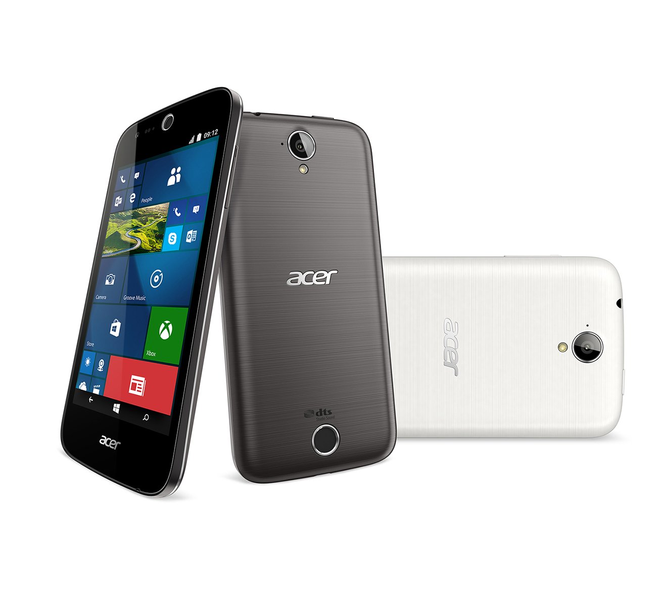
Continuum: Windows Mobile started with the name PocketPC, but until Microsoft created Continuum for Windows 10, that name was at best a misnomer. With Continuum, Microsoft has finally given Windows 10 mobile an ability that no other mobile OS has, the ability to be used like it was a desktop computer when paired with a display, a keyboard and a mouse. Continuum is dependent on two things, premium devices like the Acer Jade Primo coming out in late 2015, and a means of connection (either miracast or an accessory). Once activated, Microsoft’s universal apps will be displayed on a computer screen mimicking their appearance on the desktop. It is a really powerful interface and one that really sells the idea of universal apps.
Not everything in Windows 10 was a step forward however, in Windows Phone 7, Microsoft had introduced a mobile experience known as Bing Quick cards. These were unceremoniously killed off in Windows 10 mobile with the advent of a universal Bing app and a newer version of Cortana. While the Bing quick cards were removed so Microsoft could quickly update Bing services on the server , the mobile experience of Bing on a Windows Phone has suffered with Windows 10. It is good, but just not as good as it used to be.

Where will Windows Phone go from here: In 5 years we have seen Windows mobile move from an OS that was powerful enough to rival a computer, to a near featureless but smooth OS and back to an OS that wants to simply be an extension of your computer. What happens next to Windows Phone will depend entirely on Windows 10. Will the market reject Windows 10, will it accept it? Will Windows 10 find as much success worldwide as it has in Europe. All these questions can only be answered with time. To borrow from a cliché, wait and see where Microsoft takes Windows Phone next. If its anything like the past few years, it’ll be one hell of a ride.
Read our disclosure page to find out how can you help MSPoweruser sustain the editorial team Read more



User forum
0 messages