The new OneDrive for Windows Phone app looks like crap
![]() 2 min. read
2 min. read
![]() Published on
Published on
Share this article

Improve this guide
Read our disclosure page to find out how can you help MSPoweruser sustain the editorial team Read more
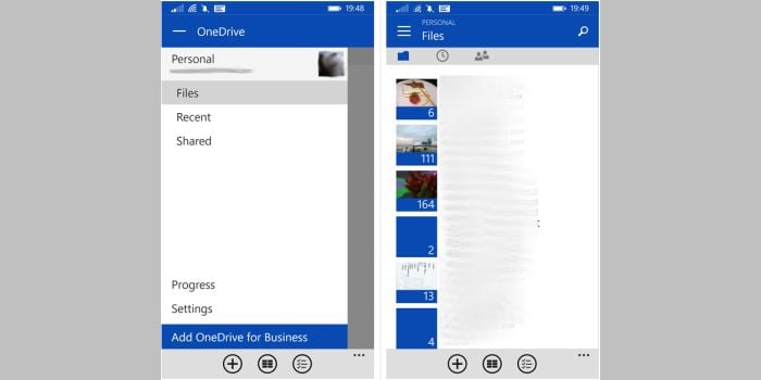

Microsoft has updated the OneDrive for Windows Phone app today, and when I first looked at it I thought my phone crashed.
I was faced with a large, mostly blank expanse which did not respond in any way to my attempts to scroll or pan. I eventually realized the single line visible on top of the screen was part of a hamburger menu, which then revealed the rest of the app, which frankly looked equally terrible, particularly with those tiny, meaningless icons (since when did a clock represent recent?) where we used to have easily legible text.
The hamburger menu, which is already passé on other mobile operating systems, is extremely unnecessary in the app, duplication the features already present in the pivot, and providing an ad for OneDrive for Business, a feature 95% of us will never use.
Now of course we know why the app looks so bad – it’s of course inspired by Android and iOS, with Microsoft using some kind of universal toolkit to design for the lowest common denominator.
It seems we should be expecting more and more Microsoft apps to adopt the “Designed for Android” look, torpedoing one of the best features of Windows Phone – the unique look and feel of the OS, and cementing Windows Phone as a 3rd class operating system, even inside Microsoft.
Copying Android apps did not work for Amazon with the Fire phone flop, and did not work for Blackberry either. Whatever excuse Microsoft concocts, we hope they do not continue this losing strategy.