Outlook for iOS updated with new design, improved user experience and more
2 min. read
Published on
Read our disclosure page to find out how can you help MSPoweruser sustain the editorial team Read more
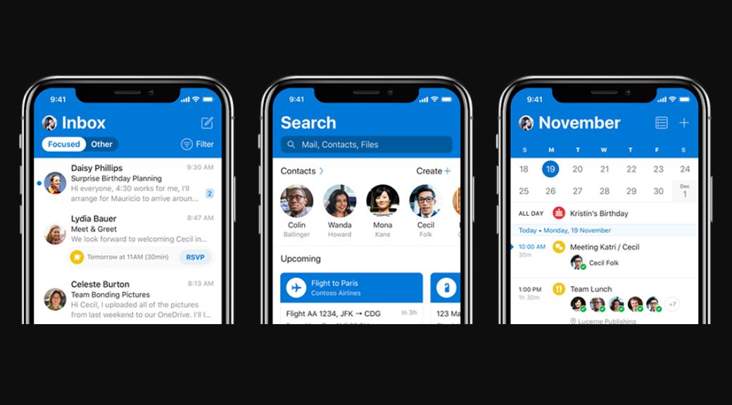
Microsoft today announced that it is rolling out a new major update for Outlook for iOS app. This update comes with updated design, improved user experience and more. Last week, we reported about the upcoming redesigned icons for Office apps and Outlook mobile app for iOS will be among the first app to adopt its new icon. Read about other design changes below.
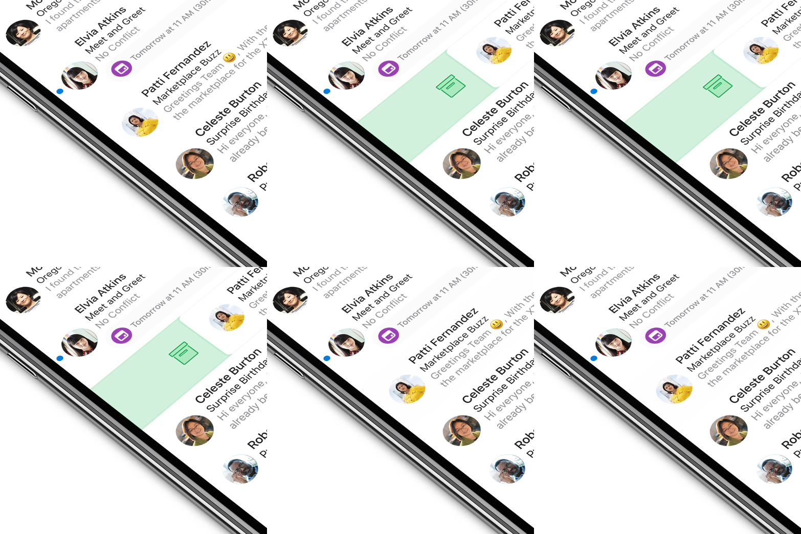
- With the new design in Outlook for iOS, when you swipe right or left on an email, you can notice subtle changes in color, shape, and iconography unfold. The corners of the message transform from hard-edged to soft and round.
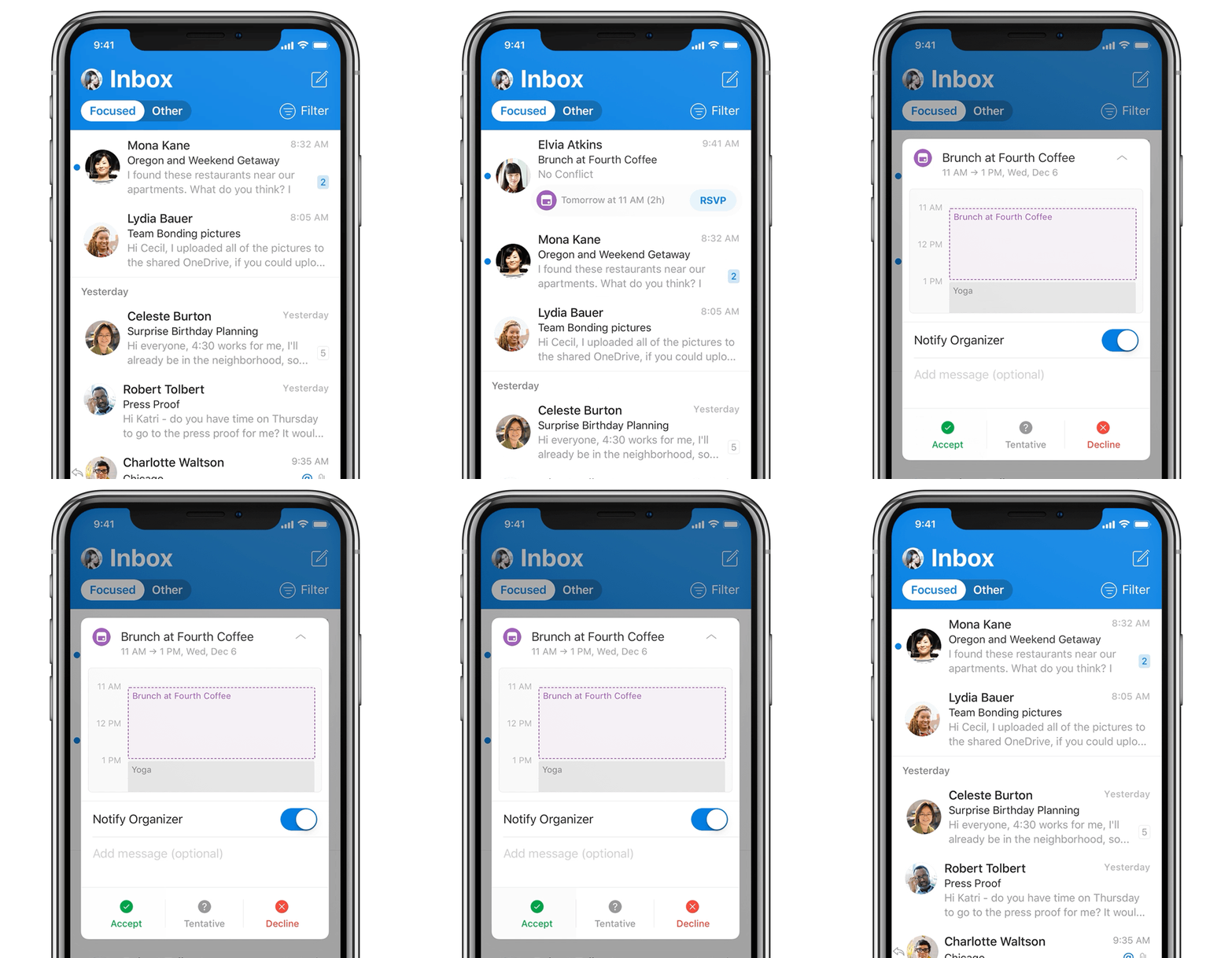
- There’s a new animated calendar icon that fans forward or backward as you scroll through your agenda, or the instant insight provided in your inbox by signaling a potential meeting conflict.
- A strong app header with bold color and typography helps you easily find your way to Outlook. And the size of the header is dynamically reduced to maximize your message list to view and find what you’re looking for.
- If you’re a single account user, the app is personalized with your avatar. If you have multiple accounts and calendars added to the app, new account icon cues help you easily switch between them.
- The Focused Inbox toggle and message list filtering experience now orientate you to your content and accounts in a way that provides clarity and confidence.
You can learn more about this design update here. This new design update will be available for Outlook for iOS users starting today.






User forum
0 messages