Microsoft will be adding a dark theme to Outlook's mobile app
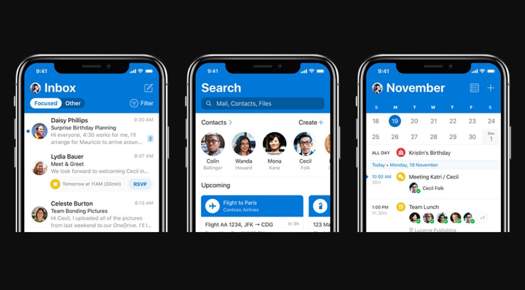
Microsoft updated its Outlook app for iOS today with a new design, and the firm will be going even further in later updates.
The firm will be adding a dark theme to its iOS app in coming updates, as reviewed in an interview with the Verge.
“Dark Mode is a more-pleasant way to read your [Outlook] email if you prefer interfaces that are less bright or if you are in a low-light environment,” Microsoft explained when it introduced dark mode to the web app earlier this year.
Microsoft has recently undergone a refocusing of its design language, first made visible with the new Office icons announced. Microsoft is moving o from flat design to a more complete embrace of Fluent, colourful interfaces and optional dark or light themes over the previous monochrome interfaces of the past.
“We’re highly coordinated internally, so the Office designers know exactly what’s coming next with Windows. The Windows designers know exactly what’s coming next with Office.” Microsoft’s Friedman explained in an interview today.
Microsoft will likely be overhauling the rest of its Android and iOS apps to reflect this newfound design ethos. It won’t happen at once, but over time we’ll see a more refined, better-designed suite of apps.
Read our disclosure page to find out how can you help MSPoweruser sustain the editorial team Read more


Improve this guide


User forum
1 messages