This Windows 10 Mobile concept looks pretty sweet
1 min. read
Published on
Read our disclosure page to find out how can you help MSPoweruser sustain the editorial team Read more
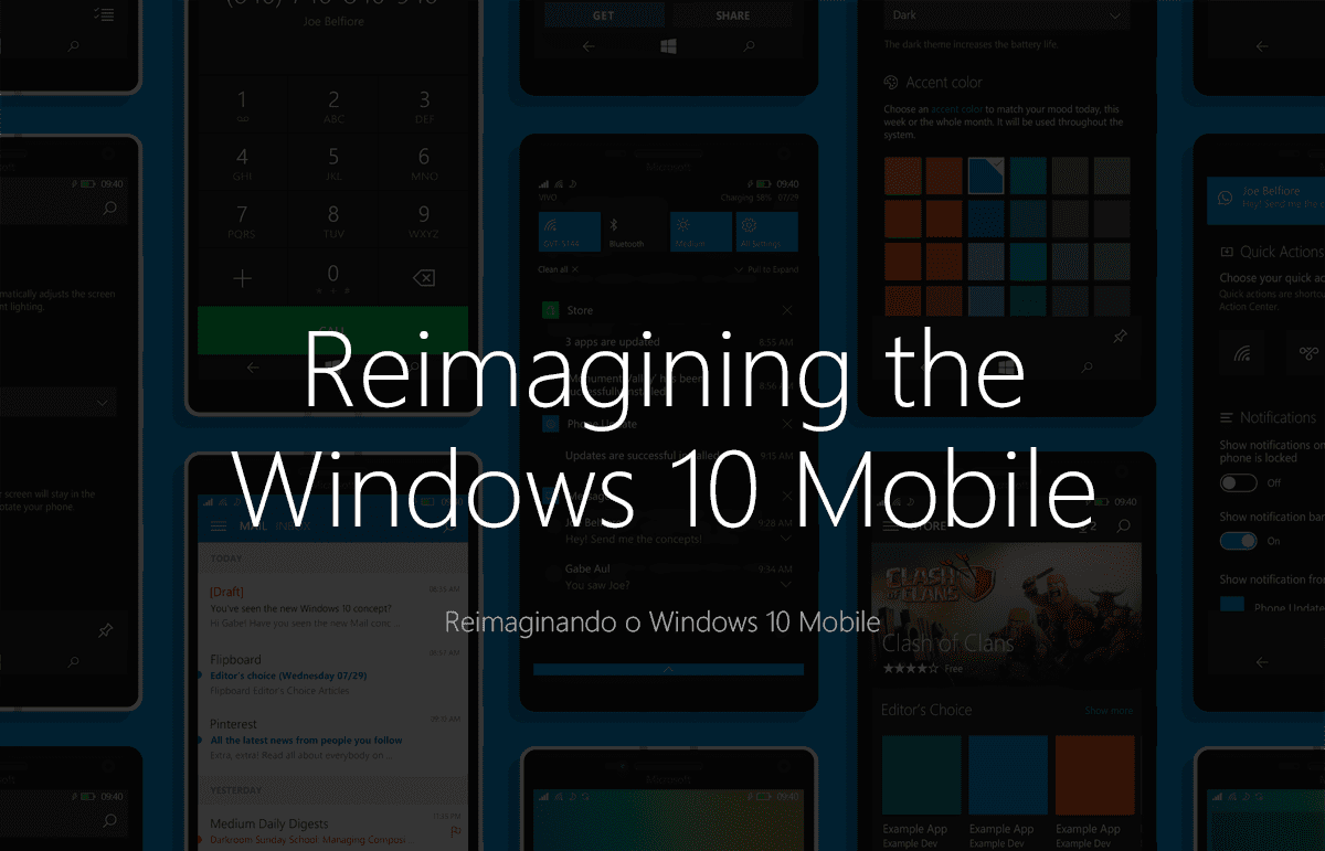
Windows 10 Mobile is expected to be released later this year and Microsoft has been working on the OS for the last couple of months. So far, the company has released a couple of Windows 10 Mobile builds to Windows Insiders. The technical preview builds of Windows 10 Mobile are pretty good, however, the UI isn’t clean enough – yet.
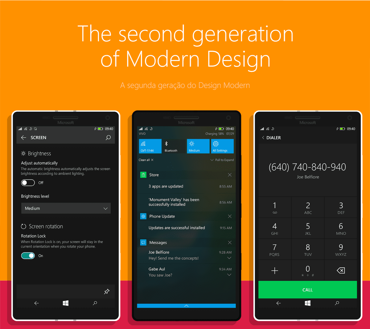
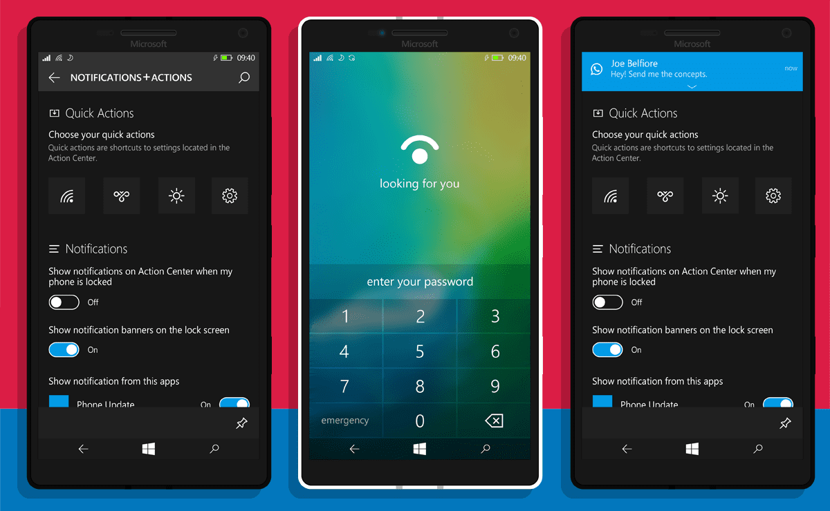
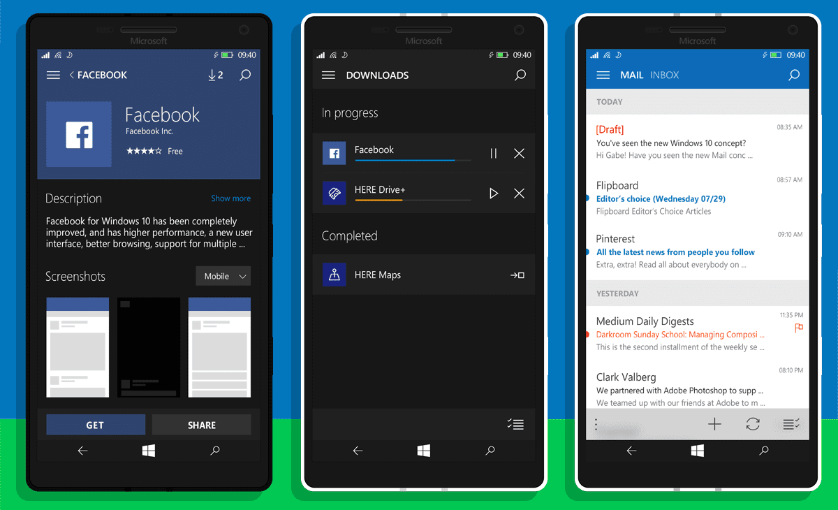
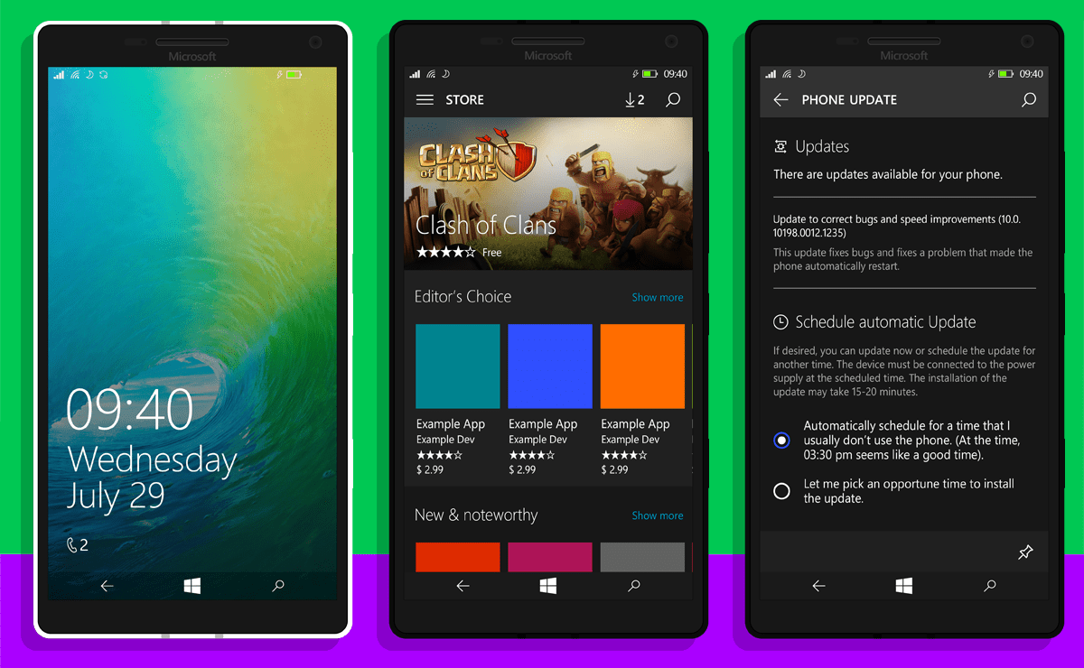
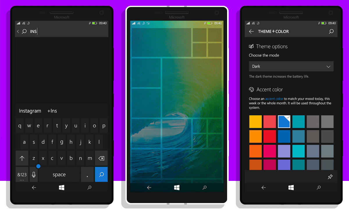
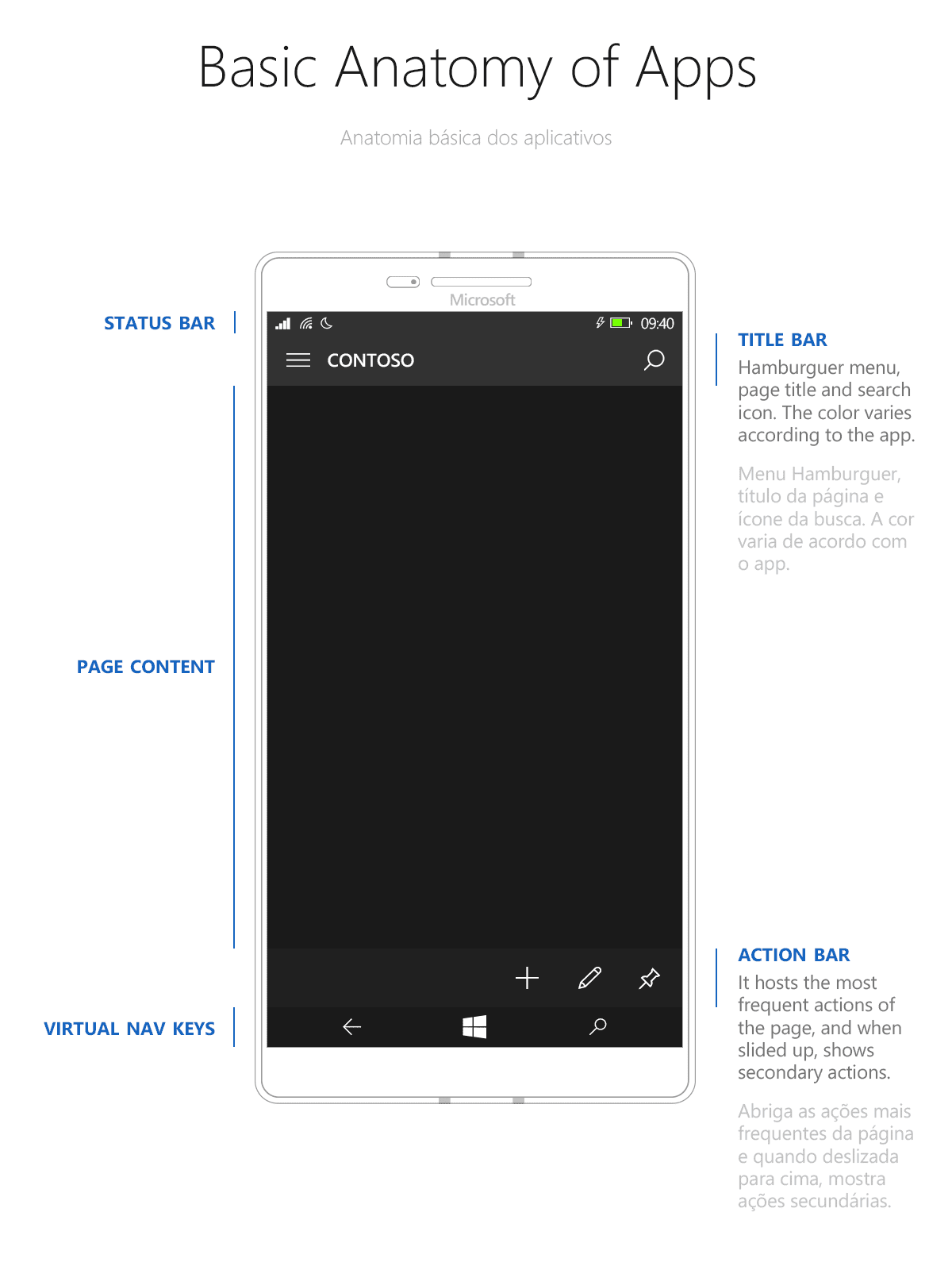
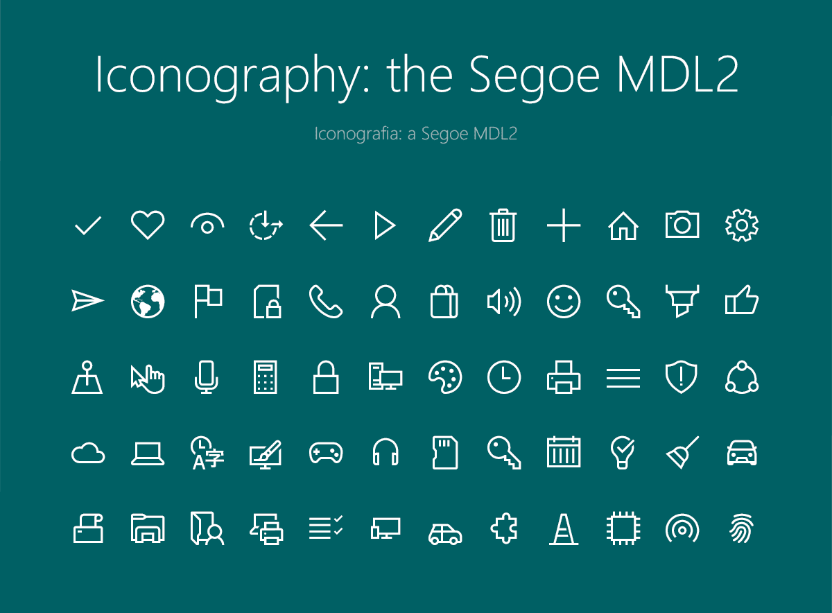
Now, designer Robson Jobs has designed a cleaner, prettier Windows 10 Mobile concept. The concepts look pretty sweet, and they’re very clean as well. Yes, the concepts look pretty similar to the current Windows 10 Mobile, but it’s just a bit cleaner and more colorful which makes it look beautiful. Jobs has added a bit of blur effect to the action center and re-designed the icons as well. Personally, I really like the concept and I won’t be too surprised if Windows 10 Mobile looks pretty similar to the concept later this year. Take a look at the concept below and let us know what you think about it in the comment section below!
Use left and right keys on your keyboard to slide the images



User forum
0 messages