Windows 10 Build 14328 for PC now available to Insiders
17 min. read
Published on
Read our disclosure page to find out how can you help MSPoweruser sustain the editorial team Read more
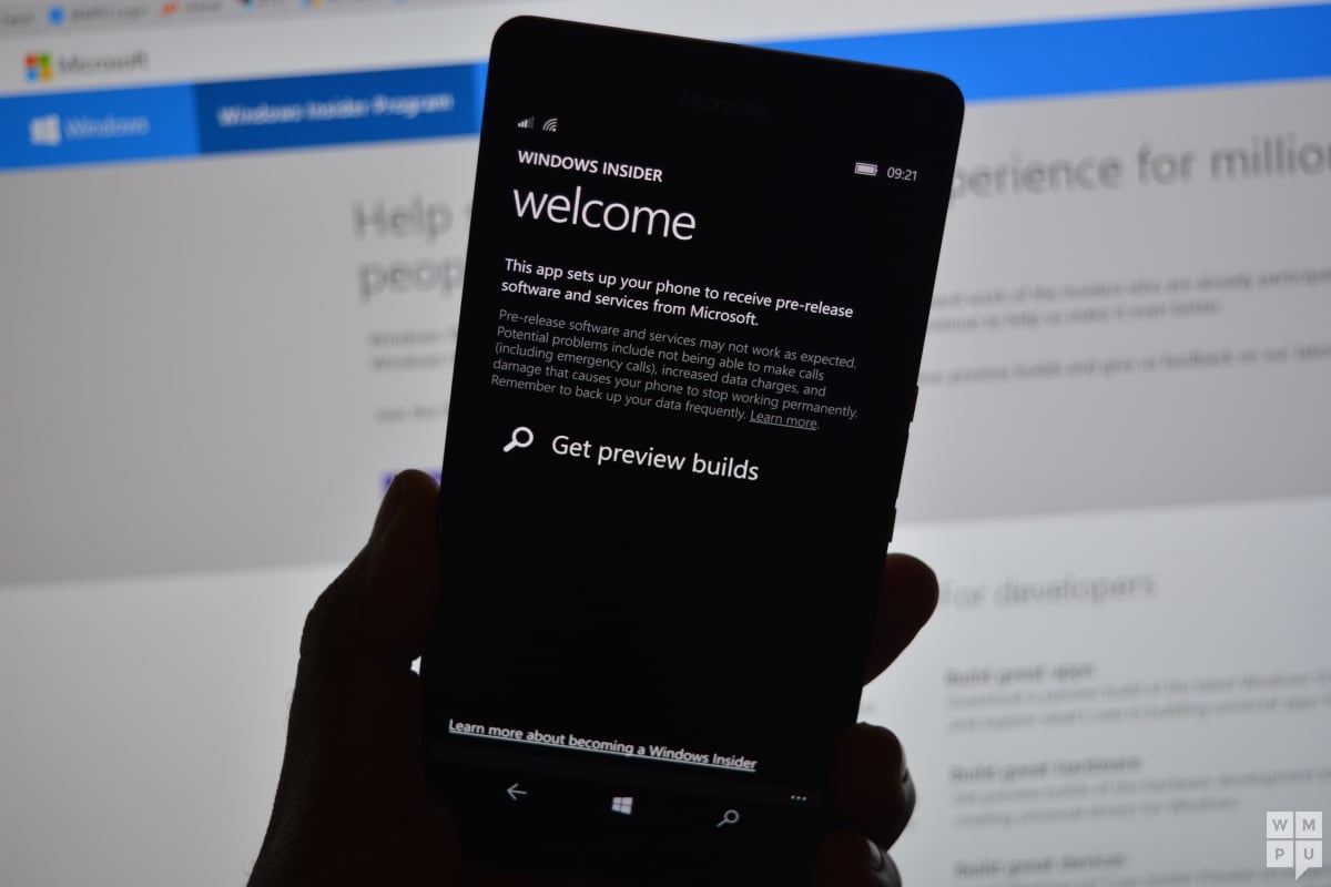
Microsoft has now made Windows 10 Insider Preview Build 14328 for both PC and Mobile to the Fast Ring.
The build is only slightly newer than the Mobile build Microsoft released on Wednesday so there isn’t a lot new for Mobile. For PC though this is a major build, packed with lots of new features and improvements including Windows Ink, updated Start, and more.
Microsoft warns for PC this build is somewhat rough, and those of nervous predisposition should probably not install it, and may want to switch to the slow ring. Preview Builds, especially Fast ring, should probably not be installed on production devices.
The update brings the following new features:
Here’s what’s new in Build 14328 for PC
Windows Ink
We announced Windows Ink at Build 2016 a few weeks ago as an all-new experience coming with the Windows 10 Anniversary Update later this summer. Starting with today’s build – you can try out the new Windows Ink experience for yourself. Windows Ink puts the power of Windows in the tip of your pen, enabling you to write on your device as you do on paper, creating sticky notes, drawing on a whiteboard, and easily sharing your analog thoughts in the digital world. Windows Ink is also integrated into apps like Maps, Microsoft Edge, and Office.
If you have a device with an active pen like the Surface Pro 4 or Surface Book – Windows Ink Workspace is enabled by default and accessible via the pen button in the notification area of your taskbar. You won’t see this button if your device does not have an active pen paired with it. However, for those of you who don’t have a device with an active pen but want to try out Windows Ink Workspace, you can right-click on the taskbar and choose “Show Windows Ink Workspace button”.
Give Windows Ink a try and let us know what you think about this exciting new experience coming for free this summer to all Windows 10 customers. For more information on Windows Ink, you can read this blog post from Andrew Shannon. And if you’re a developer you can read this blog post on how to build apps powered by Windows Ink.
Updated Start Experience
We have made improvements to the Start experience in Windows 10 which we think improves efficiency and discoverability of finding all of your apps as well as being more consistent across PC, Tablet, and Mobile.
We have merged the most used apps list and the All apps list into a single view and elevated it to the top level of the UI to reduce clicking and scrolling. You can now access all your apps with one click on the Start menu. We have also moved important functionality such as Power, Settings, and File Explorer so that they are always visible in the left rail in the Start menu, and updated the Recently added section so that it will now show 3 entries instead of just 1, and can be expanded to see the entire list of new apps.
Finally, with this new design, any additional folders you have chosen to appear on Start (via Settings > Personalization > Start such as Documents or Pictures) will now be immediately available on Start and you will no longer need to open the hamburger button to access them.
Tablet mode improvements
In tablet mode, we added features that would take advantage of the space on screen and make tablet mode feel more immersive.
Full-screen All Apps list in Start: For Start on tablets, we have brought back the full-screen All Apps list. This was a top request from Windows Insiders. The grid-like implementation of the full-screen All Apps list aims to provide efficiency while taking advantage of the additional real estate on the Start screen on a tablet. Specifically, we looked at striking a balance between density and “scan-ability” (how easy it is to scan the list to find the app you want). We have also made it easier to toggle between your pinned tiles and All Apps list on the Start screen by providing these options in the left rail which is consistent with the UI used throughout Windows.
Auto-hide taskbar in tablet mode: You can now choose to only auto-hide the taskbar in tablet mode. By hiding the taskbar, apps can take full advantage of the screen for an immersive and distraction-free experience. The setting can be found in Settings, under System > Tablet Mode. When the taskbar is hidden, swiping up from the bottom edge of the screen will make it appear. Doing so again will make it disappear.
Cortana & Search Improvements
Cortana on your Lock screen: You can now have Cortana on your Lock screen where you can ask her questions like “Remind me to take out the trash when I get home” or “When is the next Mariners game?” and get an immersive Cortana experience without having to unlock your device. You can also try asking Cortana “How is the traffic on my way home?” or “What is my schedule for tomorrow like?” For sensitive tasks or those that launch applications, Cortana will prompt you to unlock your device.
To enable Cortana on your Lock screen – go to Cortana’s settings and under “Lock screen options” turn on “Let me use Cortana even when my device is locked” and also make sure you have “Hey Cortana” enabled as well.
More ways to create Cortana Reminders: We are making it easier and quicker to set a reminder in Cortana with 2 new exciting ways to create reminders. You can now create a Photo Reminder by taking a picture of something you want to be reminded about, like that beer you just tried and want to pick up next time you’re at the store. You can also now set reminders on content from UWP apps that utilize the share contract in Windows, like Microsoft Edge and the News app, so you don’t forget to read that article your friend sent you. You can share an article from the News app to Cortana and have her remind you to read it at a later time. This even works with photos from your collection in the Photos app! Give it a try.
Cortana Cross-Device Features: With the goal of keeping you in perfect sync across all the devices where you use Cortana, we introduced new cross-device features for Cortana with the last PC build, but these features were not working correctly with Build 14295 on Mobile. With today’s new Mobile build, these features should now be working correctly. Cortana will now inform you of low battery power on your mobile devices such as your Windows phone. Additionally, you can ask Cortana to find and ring your phone, and you will be able to share maps across all your devices.
Making Cortana easier to use: Starting with this build, you will be able to get started using Cortana right away without any set up or sign-in. The goal here is to make it really easy for people who are new to Cortana to try Cortana out. Without setting up or signing in to Cortana, you can ask Cortana simple questions about the world like “How tall is the Eiffel Tower?”, conduct a web search, have her tell you a joke or search documents on your device. As you find Cortana more useful and want her to do more for you, she’ll ask you to sign-in and ask for only the details needed to help you out. The best experience for Cortana will still be a signed in experience with complete personalization, but we’re excited to give even more people the opportunity to get to know Cortana. This update will be available to everyone when we release the Windows 10 Anniversary Edition this summer.
Deeper file search, including OneDrive results: You can now quickly search your files whether they are on your PC or your personal OneDrive in the cloud. You can search for documents, photos, music as well as videos stored on OneDrive. Just search for something you need to find and click one of the search filters (e.g. documents, photos, music, or videos) and it will show you content from your OneDrive.
Improvements to Action Center & Notifications
Evolving the entry point for Action Center: The Action Center icon has moved to the far corner of the taskbar so it is more distinct from other icons – making it easier to interact with it. There is a badge that now displays the number of notifications you have missed, and we are making it easier for you to know what app your notifications are from by adding a subtle animation to the icon (showing the sender app’s logo) whenever you receive notifications that do not show a toast.
Visual changes to Action Center: Individual app notifications in Action Center no longer show the app icon repeated for each notification and will only be seen in the header that groups together all the notifications specific for that app. This change allows for more space in Action Center to show more content.
Cortana notifications in Action Center: We have also added new insights from Cortana to ensure you are not missing anything important, such as a meeting conflict or anything she needs to remind you about.
Customize your Quick Actions in Action Center: You can add, remove and re-arrange the Quick Actions that show up in Action Center. To customize your Quick Actions, just go to the Settings > System > Notifications & actions. In this settings page, you will see a replica of your Quick Actions as it appears in Action Center, and with a simple press and hold you can move the Quick Actions to the place where you want them to be. Then to add or remove a Quick Action, there is a link below the grid that will allow you to turn on or off the available Quick Actions. The last preview build for Mobile introduced this for your Windows 10 phones, and now we’re bringing it to PC too.
Wi-Fi Quick Action changes: The Wi-Fi Quick Action directly takes you to the “View Available Network” flyout instead of turning ON/OFF your Wi-Fi. We received a lot of feedback on this from Windows Insiders and customers who were confused by the Wi-Fi Quick Action.
Updates to the Taskbar
Taskbar clock now integrates your calendar: Your calendar events are now just one click away – you can easily check your daily schedule directly in the taskbar clock flyout, after connecting your accounts in the Calendar app. If you click on an event in the flyout, it will redirect you to that event’s details in the Calendar app. You can also add a new event by clicking the “+” button.
Taskbar clock on all monitors: We heard a lot of requests for this from our gaming community. We’re happy to announce that for the first time since the taskbar was created, if you have multiple monitors and your taskbar set to show on all displays, the clock will now be visible on each Taskbar.
Taskbar Badging for UWP apps: You will now see badges appearing on UWP apps on the taskbar in addition to their Live Tiles and in Action Center. These badges are lightweight notifications that are contextual and specific to individual apps. For example, the Mail apps badge shows you the number of unseen emails (not unread). The Alarms & Clock app’s badge will show you that you have an active alarm. The Weather app’s badge lets you know when there is a weather alert in the area.
Taskbar settings now in Settings app: We have now moved the taskbar settings into the Settings app. Just go to Settings > System > Taskbar or right-click on the taskbar to go directly to this page in the Settings app. As an added bonus, these settings are now discoverable by searching with Cortana.
Manage multiple playback devices from the Taskbar: The volume flyout has been updated to allow you to switch between multiple audio output devices. Just click the arrow next to current audio output in use to expand and see other output devices available.
Updates to the Settings app
Icons for individual settings pages: All pages in the Settings app now have individual icons associated with them. These individual icons will also be shown when you pin a settings page to Start. And we have also added a dropdown flyout with page suggestions that will appear as you type into the Settings search box. These changes are designed to make it easier to find the settings you are looking for.
Updated Pen settings page:The Pen settings page under Settings > Devices > Pen has been updated to include the ability to adjust your pen shortcuts (e.g. click one to open OneNote), a new option to ignore touch input when using the pen, and Windows Ink Workspace settings. The touch keyboard and handwriting panel settings have been split up and you can choose to ignore touch input when using the pen.
Improved app management: We have added the ability to reset an app if it gets into a bad state under Settings > Apps and features. This is useful if an app gets into a bad state and you want to delete its data and start over. Just choose “Advanced options” for a specific app under Settings > Apps and features and you will see the reset button. Note that not all apps currently support reset however. You will also be able manage app add-ons and downloadable content here too if the app supports this capability as discussed at Build 2016. While there are currently no apps that support add-ons or downloadable content in the Store, please stay tuned for availability of apps that do once they are released.
Windows Insider Program settings page: We have moved the Windows Insider Program settings to its own settings page. This is where you can go to join the Windows Insider Program (or stop receiving Insider Preview builds) and adjust which ring you are in. On Mobile – for Build 14327 and higher, the Windows Insider app is no longer required. To get to this new page, go to Settings > Update & security > Windows Insider Program.
Switching desktops with the touchpad
Virtual desktop users can now switch quickly between desktops using their touchpads. To do this, swipe four fingers left or right on your touchpad. Try switching desktops with a quick-flick. And if you want to refer to two adjacent desktops you can keep your fingers down and drag back and forth. You will need a precision touchpad that supports four or more fingers, such as the precision touchpads found on Surface Book or Surface Pro 4 Type Cover. While you’re at ittry these other touchpad gestures supported in Windows 10.
Lock screen Improvements
Email addresses are hidden on the Lock screen: Your privacy is important to us and we received feedback that people did not want their email addresses displayed on the Lock screen. Email addresses are now hidden by default. If you would like your email address to show in the Lock screen, you can change this setting by going to Settings > Accounts > Sign-in options > Privacy.
Media controls show on top of the Lock screen: Media controls will now appear embedded at the bottom right corner of the Lock screen, along with a picture of the album art from the song currently playing.
Updated Credential & UAC Dialog UI
When you are prompted to enter your credentials or elevate a program, you will notice the dialog now has a fresh and modern UI to align with the design language in use across Windows 10. And now when prompted to enter credentials, you can choose to sign-in with Windows Hello, a PIN, certificates or a simple password.

Updated Skype UWP Preview app
With the updated version of the Skype UWP Preview app, you can now create and send group messages, as well as make group audio and video calls. For more information on this update to the Skype UWP Preview app, see this blog post here.
Updated File Explorer icon
Windows Insiders love finding new icons. This one is pretty noticeable so we wanted to call it out. We’ve updated the File Explorer icon to align with the monochrome design language used for the icons across Windows 10. However, you will notice a little bit of color still present in the icon. The design team was a bit hesitant to completely let go of the yellow because it has become such a familiar part of the File Explorer branding.
They explored a variety of different ways to keep the yellow and still match the cleanliness of the black and white Windows app icons. The new icon you see in this build is where the design team landed that is closer to monochrome, but still has the familiar shape that users recognize, and has a nod to the yellow that you see all throughout File Explorer. Let us know what you think.
File Explorer Unpinned from the Taskbar
We hear feedback from Windows Insiders about how important the space on the taskbar is for them, and we made a major change in Windows 10 early last year based on their feedback when we added an option to hide the search box. We’re continuing to look at things we can do to make this the best use of space possible, including what gets pinned by default. In this build we are unpinning File Explorer by default to see whether Insiders prefer it pinned, or would rather have the space for their own use and launch File Explorer when they need it from Start. You can also re-pin it to your taskbar by opening Start, right-clicking on File Explorer in the left rail, choosing “More” and then “Pin to taskbar”. Tell us what you think about this via the Feedback Hub. This study is similar to the one we did a year ago where Insiders helped determine what windows were represented on the taskbar in virtual desktops.
Japanese IME Improvements
Prediction capability enhancements on Japanese IME: You can expand prediction candidate window by hitting Tab key at the bottom of the candidate window to find various formats of date expressions. Conversion result is also shown in prediction candidate window when your text is relatively long.
Improved typing history management in Japanese IME: You can now choose to store your typing history to a temporary repository and have it cleared automatically to avoid an inadvertent exposure to other people through the IME candidate window, without losing the important typing history you had accumulated over time. Just enable the mode from the context menu available on IME mode indicator. When you have finished typing, disable the mode from the same menu to have the temporary repository cleared. This functionality is automatically enabled during InPrivate browsing with Microsoft Edge and Internet Explorer.
Improved Cloud suggestions in Japanese IME: The IME UI has been improved to indicate the availability of Cloud suggestions! You will be notified in the candidate window when Cloud suggestions are available to use and can enjoy the rich vocabularies empowered by Bing. The flyout navigates users to the Settings, allowing them to switch to use Cloud suggestions more seamlessly as you type text.






User forum
8 messages