Microsoft said they designed the Surface Duo for mobile-first countries like India and China
2 min. read
Published on
Read our disclosure page to find out how can you help MSPoweruser sustain the editorial team Read more
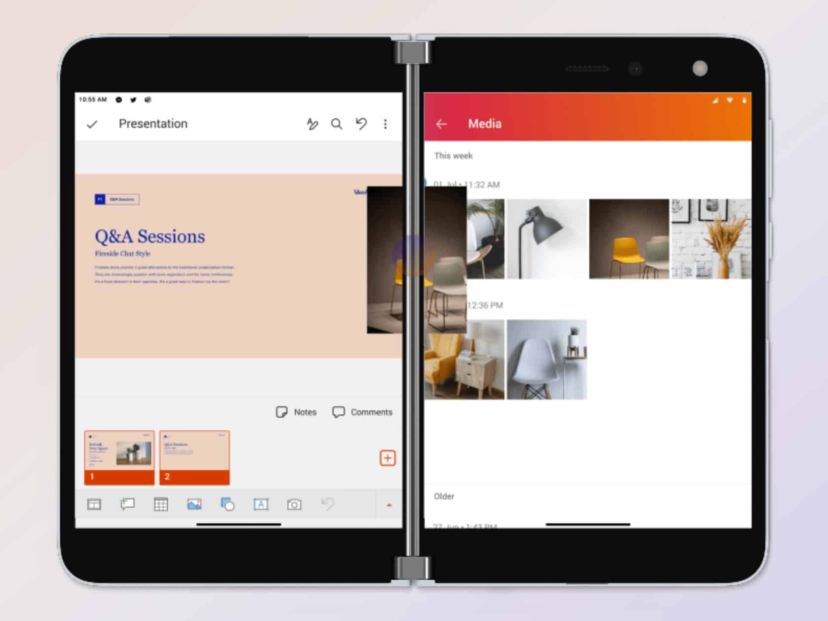
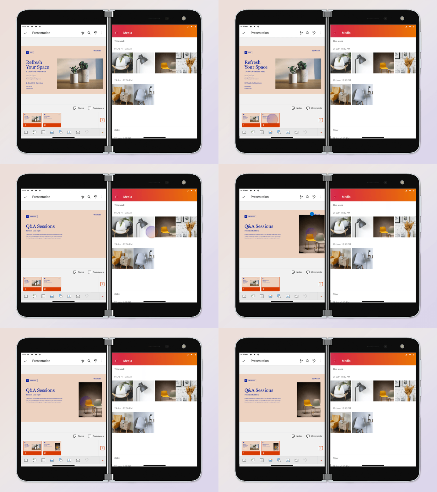
Microsoft today formally announced the Surface Duo, their dual-screen smartphone. On Medium the Microsoft Design team spoke to the Office team about the work they did for their app on the device.
In the interview, Deepak Menon, who leads the design team for the Office app on mobile, revealed they designed their app after studying people in mobile-first countries like India and China who wanted to start and finish a task on the same device.
He notes the design takes content consumption to the next level, for example viewing your whole weekly calendar at one glance or view a whole two-page document ( the most common length) at one time on the opposing screens.
He also said the team saw the seam as an opportunity rather than a constraint, saying the seam between the screens reduces the cognitive burden of managing windows manually.
In some cases, the seam separates two apps. In others, it creates panels where you can do separate actions or switch back and forth between those consumption and creation micro-moments more smoothly.
Jon Friedman, head of Microsoft Office Design, said they designed the Surface Duo to close the gaps between what people are trying to accomplish and the tools that are available to them.
They, however, admitted that the Surface Duo was a first-generation device and that the team had a lot more exploring of the problem space to do.
Read all their ideas here.







User forum
0 messages