Microsoft News: Microsoft is testing Bing ‘Compact Mode’ again
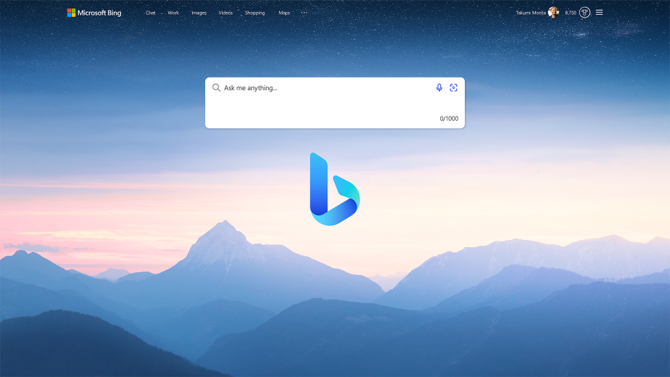
Microsoft has been spotted testing “Compact Mode” in Bing. Using the feature, users have the option to view fewer details, making the interface of the search engine neater. The feature was first tested years ago.
Bing has been receiving plenty of attention from Microsoft recently as its race to catch up with Google continues. This battle is further fueled by Microsoft’s multi-billion dollar investment in ChatGPT-creator OpenAI, resulting in new AI features on Bing. Bing’s improvements, nonetheless, are not just limited to AI. Microsoft is also trying to enhance the browsing experience in the search engine. Today, the company surfed its file cabinet to try and test an old feature – the Compact Mode.
The test of the feature was shared on Reddit by a user named yokoffing. It will be in the form of a toggle button under Bing’s tabs (e.g., Search, Chat, Images) when you search for a topic. When activated, Compact Mode will remove some information and visual cards that offer specific and additional details about the search, albeit it means less glanceable information about the subject. Moreover, it seems the test is not available in all searches. As yokoffing noted in the post, the mode only appears on specific searches involving results from Wikipedia and not in others.
While the feature looks new for some, it is important to note that Compact Mode was tested before. In 2021, Bing was also spotted with a Compact Mode by Search Engine Roundtable. However, the difference between the past and the current tests is the significant changes the mode can make now in the UI of Bing, especially with Microsoft trying to make Bing more visually informative these days.
Read our disclosure page to find out how can you help MSPoweruser sustain the editorial team Read more
User forum
0 messages