Microsoft divides the Widgets Board in two on the latest Windows 11 Insider's Preview
Key notes
- Windows 11 Insider Preview separates widgets into “My Widgets” and “Discover” sections for focus and exploration.
- My Widgets dashboard offers dedicated space for chosen widgets, potentially minimizing distractions.
- Discover feed curates news, interests, and personalized content within the widgets board.
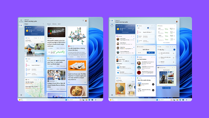
The latest Insider Preview Build 26058 will bring a revamped widgets experience divided into two distinct sections: My Widgets and Discover. This change will enhance the user experience and is expected to be well-received by Windows users.
My Widgets
The new My Widgets dashboard offers a dedicated space for your favorite widgets, free from the clutter of other content. This allows for a more focused and personalized experience, letting you quickly access the information that matters most.
Discover
If you ever need fresh content, Microsoft has covered it. Discover is your gateway to a thoughtfully curated feed of news, interests, and personalized content. Keep yourself informed and engaged with a wider range of topics, all within the familiarity of your widgets board. This definitely feels like Google Discover on Androids.
The new navigation bar on the left lets you effortlessly switch between My Widgets and Discover with a single click. Microsoft has also unveiled sniper-esque mouse pointers in this build for better efficiency.

This exciting update is available only to select Windows Insiders in the Canary and Dev Channels. So, if you’re not already part of the program, you’ll have to wait a bit longer to experience the divided widgets board.
While the divided widgets board is an Insider exclusive, its wider rollout depends on further testing and feedback.
More here.
Read our disclosure page to find out how can you help MSPoweruser sustain the editorial team Read more
User forum
0 messages