Windows 10 vs Windows Phone 8.1 UI - In Pictures
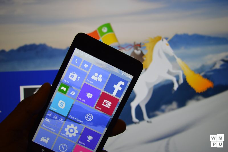
While Microsoft ‘a Windows 10 UX paradigms may be completely different from it’s previous Windows Phone ones, it’s UI is an evolution of the former Windows Phone UI. Now, the mobile operating system takes more cues from the desktop operating system than its predecessor and we have to say the result is…pretty good looking (in many cases). A Martin Anderson put together a visual comparison of the various controls of Windows 8.1 and Windows Phone 8.1 and compared it to their various Windows 10 counterparts. Take a look below, it’s pretty interesting how the two platforms evolved.
Click to enlarge
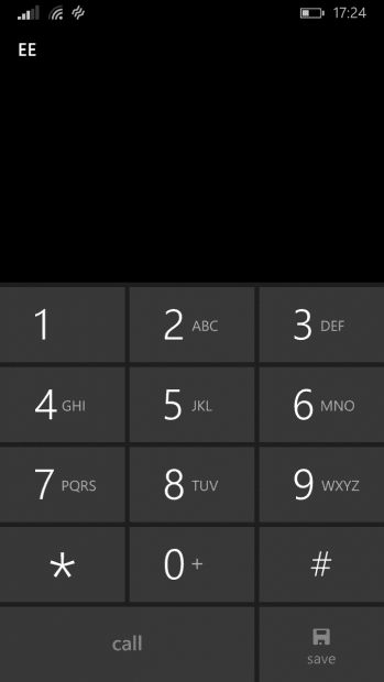
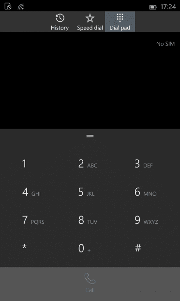
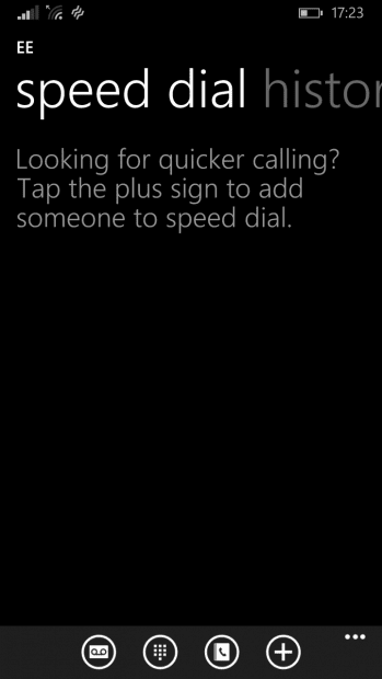
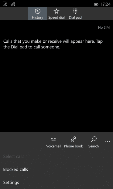
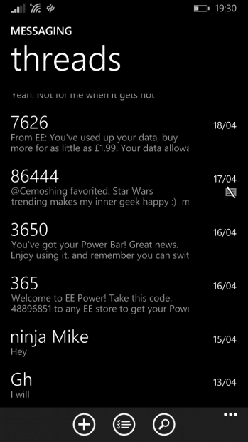
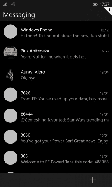
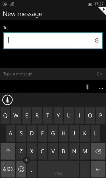
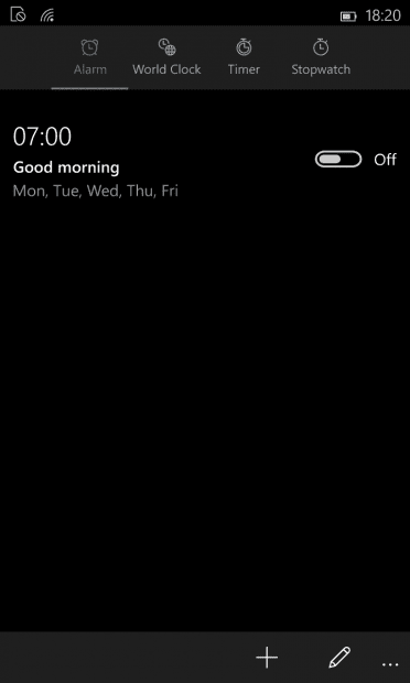
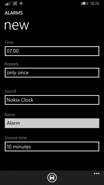
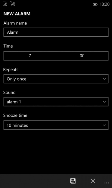
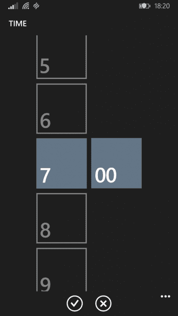
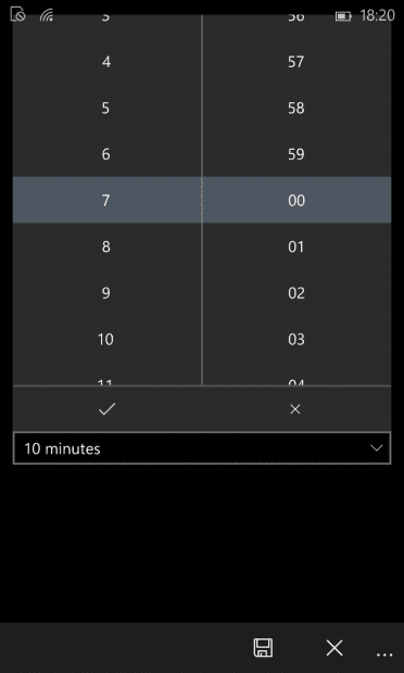
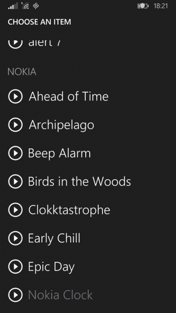
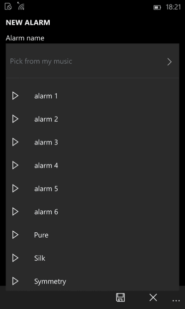
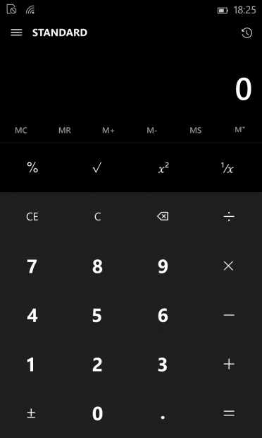
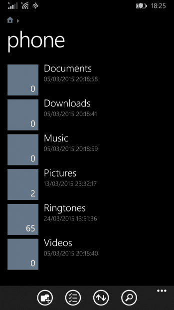
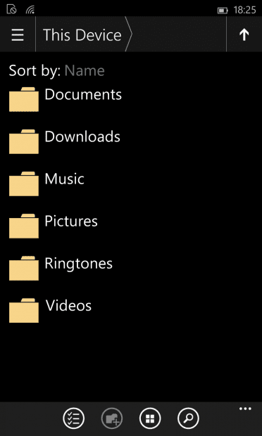
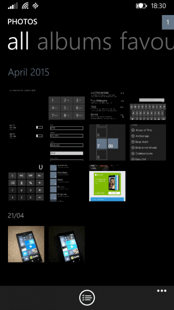
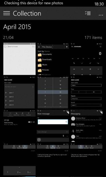
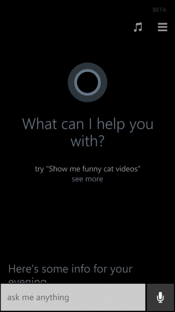
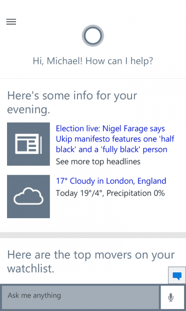
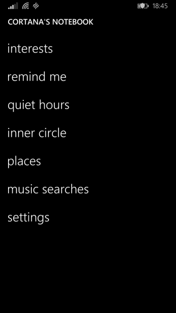
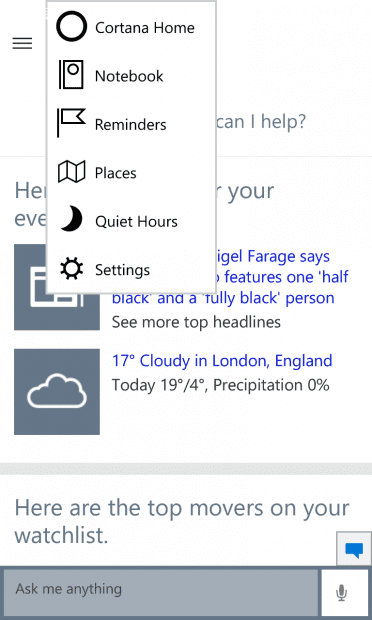
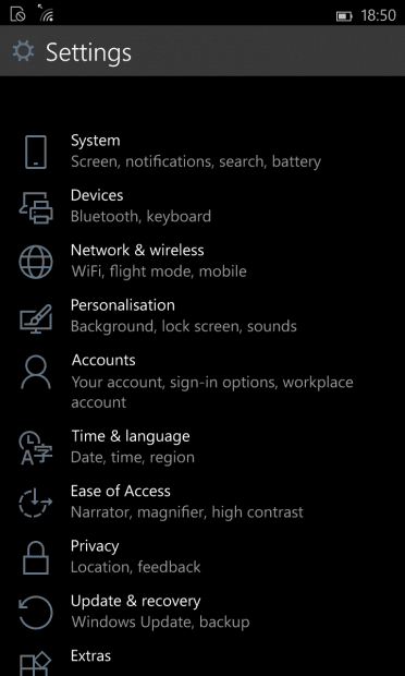
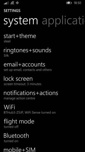
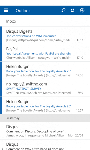
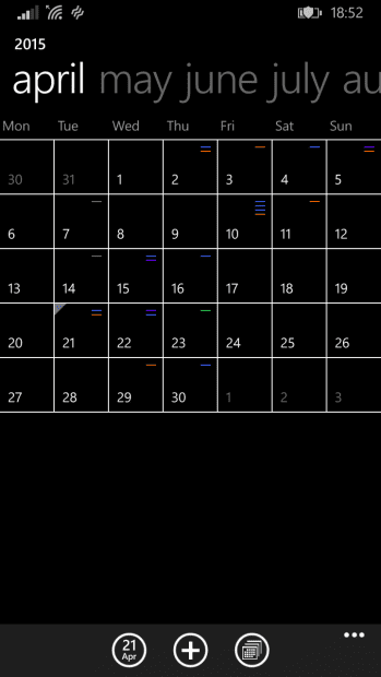
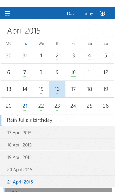
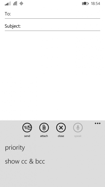
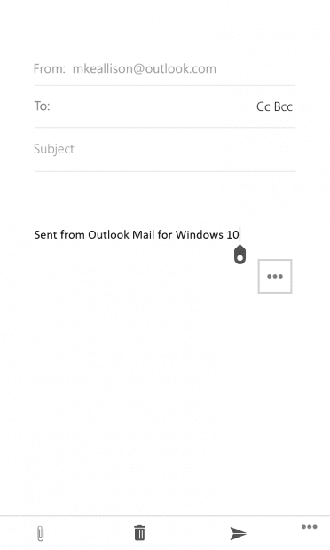
For our part, we put together a collection of comparison pictures from Windows Phone 8.1 on a Lumia 830 and Windows 10 for Phones and Small tablets on a Lumia 925. For the most bit, the reliance on text is gone in virtually all the bundled apps with Microsoft substituting cleaner wireframe icons instead. In some places, Microsoft has added the hamburger menu, a navigational tool that predates the modern smartphone. While this may make navigation more difficult in places like Outlook, it also helps apps like the calculator expose more functionality than they did in previous iterations- lets face it, a hamburger menu is more discoverable than turning your phone different ways for different functions in a calculator app. Gone also are the swipe based gestures for navigation, now apps like the phone app and the clock app now rely on tapping the tabs at the top to get around. While this may not be particularly user-friendly, it is still a preview and Microsoft could easily add gesture navigation sometime before Windows 10 mobile becomes fully baked.
Have a look at the images below:
So far, while Windows 10 Mobile appears to be a different OS in terms of philosophy, it is shaping up to be pretty good in in its own right. All it needs are some tweaks here and there to make the experience on a phone better than it’s predecerssors and I don’t think many Windows Phone users would find a reason to complain.
What do you think of the evolution of Windows Phone? Let us know in the comment below
Read our disclosure page to find out how can you help MSPoweruser sustain the editorial team Read more











User forum
0 messages