Another attempt to fix the Windows 10 Mobile UI
1 min. read
Published on
Read our disclosure page to find out how can you help MSPoweruser sustain the editorial team Read more
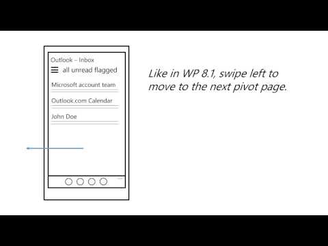
The new Windows 10 Mobile user interface has been a big source of controversy, and numerous readers have asked us to post their ideas for a better design that the current pivot-less hamburger implementation.
The latest is Andrew, who is trying to reconcile the best of both worlds, as demonstrated in the video above.
What do our readers think of his ideas?





User forum
0 messages