Sticky Notes updated for preview users
1 min. read
Published on
Read our disclosure page to find out how can you help MSPoweruser sustain the editorial team Read more
Microsoft has been on an app updating spree recently.
The company has released subsequent updates to all of its core Windows 10 apps throughout the course of the day, and one of the more recently updated apps has been the new Sticky Notes preview. As expected, this update provides additional improvements and stability, as well as bringing about a subtle user interface change.
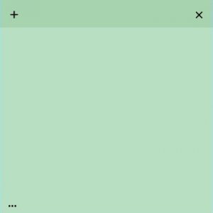
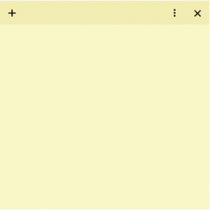
The “additional options” app bar has now been moved from the bottom-left corner to the top-right, bringing itself in line with the “close sticky note” button. The updated design looks quite similar to Android’s command overflow bar, as well.
Will this new button placement stick with you? Notify us in the comments.
[appbox windowsstore 9nblggh4qghw]


User forum
13 messages