Read about the development of Microsoft's new Feedback Hub
7 min. read
Published on
Read our disclosure page to find out how can you help MSPoweruser sustain the editorial team Read more
The Program Manager of the Windows Feedback team has written about the conception and development of the new Feedback Hub which will be part of the Redstone Build of Windows 10.
Because the post was itself published in the Feedback Hub it can only be read by Insiders, which means many users will not be able to appreciate the iterative design process of an important Windows component.
We have however freed the post from that confines, and it can now be read in full below.
Made by you – Introducing Feedback Hub, brought to you by your feedback
Hello Windows Insiders!
I’m Lauren Gust, a program manager on the Windows Feedback team. We support the Insider community and help you share your ideas and suggestions through the Feedback Hub and toast notification mini-surveys. We also make sure it’s easy for engineers to find and act on your feedback. If you’re interested in learning more about how we collect and use your feedback, I’d recommend reading this excellent post that Samer from our team previously shared. Right now, I’m excited to tell you about how we used your feedback to combine the Insider Hub and Windows Feedback app into the new Feedback Hub app.
How we got here…
When we first launched the Windows Insider Program during early Windows 10 development, we introduced two apps: the Windows Feedback app to collect feedback from millions of Windows users and Insider Hub to provide a tailored experience for Insiders to stay up to date with preview builds. As we developed these apps, we noticed that there were many cross-overs and similarities between them. For example, known issues we were publishing in Insider Hub were also being reported through Windows Feedback. We concluded that giving feedback and being an Insider are closely linked, and that we should build an app that reflected this.
As we monitored feedback from Insiders, we saw that many of you were thinking the same thing. We received 574 upvotes across 21 different suggestions like ”Combine feedback into Insider Hub” and “Please merge Insider Hub and Windows Feedback app.” With your confirmation that we were on the right track, we started planning how we would merge Insider Hub and Windows Feedback. During the planning process we got another dose of Insider goodness when a group of Insiders visited the Redmond campus and created some awesome mockups which included really cool new features that could be enabled with a combined app (in fact, they’re still hanging in my office as inspiration). With your help, we were on our way!
Merging the apps
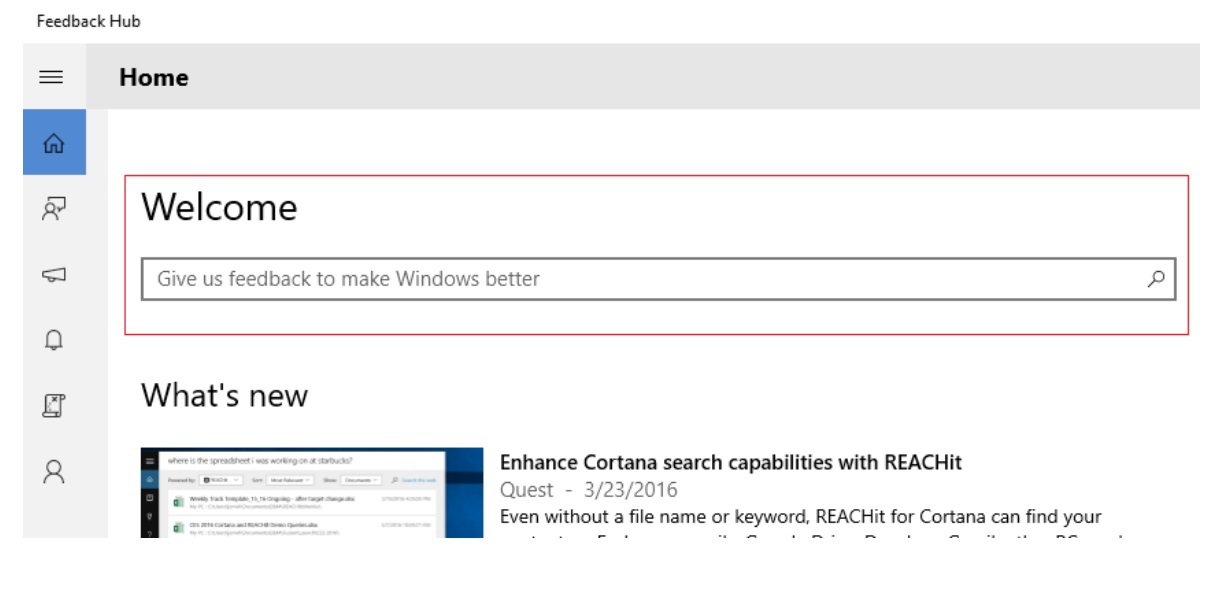
When we began the process of merging the apps, we tried to keep an experience that was familiar to users of both apps. In some cases, we made small fixes, like making sure the pages in the app used consistent fonts and colors. In some cases, there were more substantial changes, like adding the feedback search box on the Feedback Hub
home page.
In the old Windows Feedback app, when you opened the app you could instantly start searching and browsing for feedback. However, in the new combined app, we’d have a new landing page with a content feed to help Insiders stay up to date with news and updates. We soon realized that even though we were introducing this landing page, we didn’t want to create an extra step where you’d have to click the Feedback tab in the navigation bar before submitting new feedback. We’re hoping that the search box has reached a happy medium, but we’re relying on your feedback to let us know.
Iteration and validation
The search box example fits into a bigger story about how we design and roll out the app; one that requires many rounds of iterating through different designs and testing them; first within Microsoft, then in the Insider community. Here’s a quick overview of how this process works:
Landing on a design
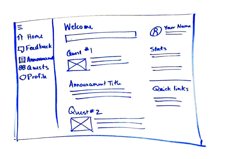
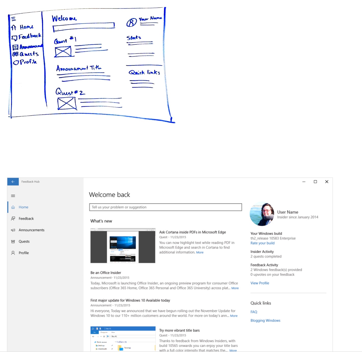
Since it’s much easier to modify a design before it’s coded in the app, we always start our design process with mockups and what we call UI wireframes (see the examples I’ve included below). Early in the process we use simple whiteboard sketches to brainstorm concepts and quickly iterate on ideas. Next, we make rough mockups of the basic use cases and review these with the team to see if any major redesigns are needed. Once we’ve landed on what we think is roughly the right design, Lindsey, our designer, creates more polished versions of our mockups. At this stage, the mockups look very similar to what will actually appear in the app. Finally, the program manager reviews the final design with the team to get one last round of feedback and make any last tweaks before the developer starts coding.
Our design process doesn’t just happen only once for the entire app. When we first combined the apps, we took each page in the app and applied our design process to land on what UI should be updated. Then we start adding new features; for example, the new description field for feedback. Each new feature goes through the same iterative process of feed back and redesign. Even when a feature is coded, the process doesn’t stop there- we’re always making tweaks to our design based on feedback from internal users and Windows Insiders.
From design to reality
Once we’ve landed on a design, our software engineers start making the magic happen, and turning that design into a reality. Whenever a new feature goes live in the app, we ask our fellow internal users to start trying it out and sending feedback on their experience. We like to refer to this process as “dogfooding” because we’re eating our own dogfood”, in other words, using the software we’ve built and making sure that we’re finding and fixing the worst issues before we send it out to you. Sometimes we miss things (like strange fonts in Feedback Hub that many international Insiders have reported in Windows Insider Preview Build 14291), so we really appreciate your help in identifying these issues.
When we first released the Feedback Hub internally, we asked everyone to try out these key scenarios and validate that they worked:
searching for feedback, upvoting feedback, giving new feedback, doing quests, and reading announcements. For our first internal releases, we actually had two feedback apps in the build: the new Feedback Hub, which we were validating; and the old Windows Feedback app, which we kept as a backup so that users could still file feedback if any of our key scenarios weren’t working. As a reminder, our engineers use the Feedback Hub just like you do, to file issues, upvote, and track down problems. Once we were confident that the Feedback Hub was working at parity with our old apps, Insider Hub and Feedback app were removed from internal builds, and we were ready for the converged Feedback Hub app to go out to Insiders.
What’s next
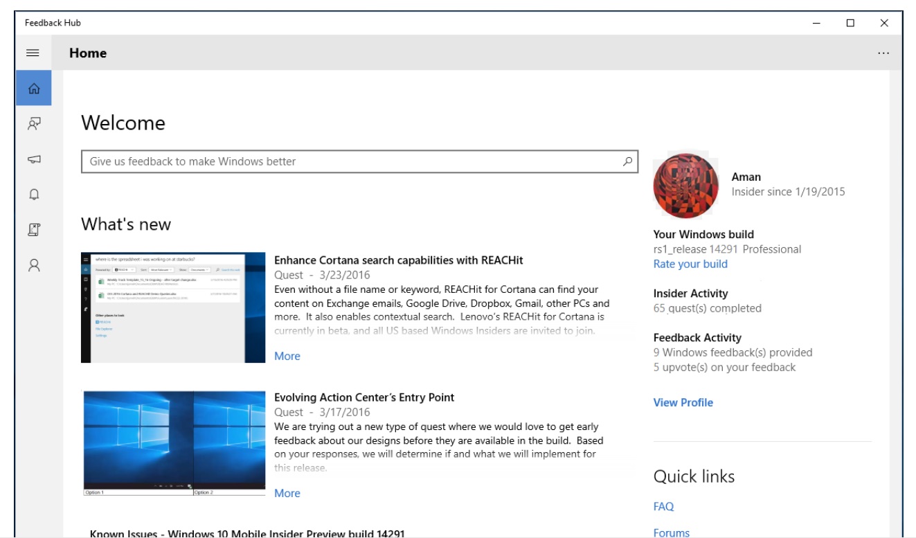
What you’re seeing today (a.k.a. Windows 10 Insider Preview Build 14295) is the start of a long and exciting road ahead for the Feedback Hub. We’re still hard at work bringing new capabilities into the app, and over the next few weeks you’ll see new functionality and more UI polish. You’ll also start seeing some mini-surveys asking about the Feedback Hub, which we’ll use to understand what you like, and where we can continue improving. In the meantime, keep sending us feedback and telling us what you love and what we can do better. We love hearing from you.
On behalf of the Windows Feedback team,
Lauren Gust




User forum
1 messages