Microsoft considering a much improved "All Apps List" in Windows 10 Start Menu (Tablet Mode)
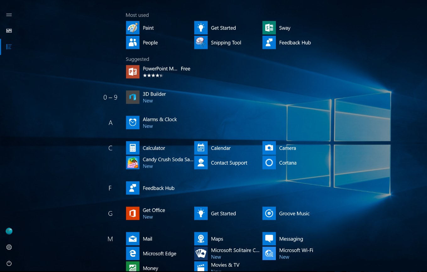
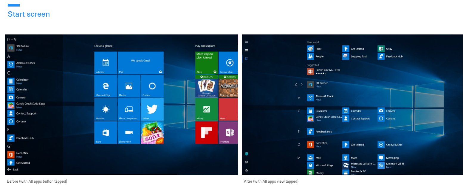
Microsoft recently unveiled Windows 10 Anniversary Update, the upcoming major update for Windows 10. With the upcoming update, Microsoft is expected to introduce some new features and the company will also be introducing some new UI and UX improvements. Today, the company posted a new Quest in the Feedback Hub about an improved Start Screen and Start Menu. The company is looking to improve the All Apps list in the Start Screen and Start Menu with Windows 10 Anniversary Update. Here’s a comparison between the current Start Screen and the planned UI for the improved Start Screen:
(click to enlarge)
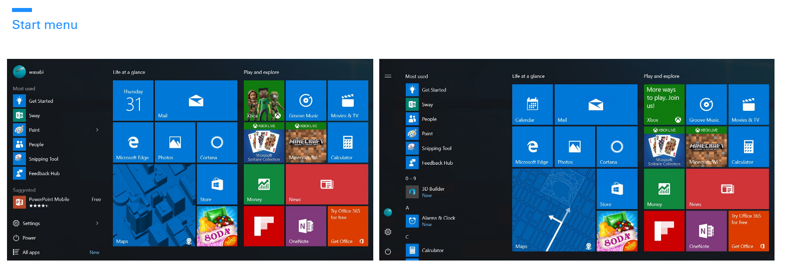
As you can see, the upcoming/planned Start Screen includes an All Apps list which looks a lot like the one in Windows 8.1. Of course, this will only show up for tablet users using the Tablet Mode in Windows 10 and I think this will provide a better experience than the current All Apps list in a tablet. Additionally, Microsoft also posted a comparison for the Start Screen which can see below:
(click to enlarge)
As you can see, there doesn’t seem to be any major changes there — but, Microsoft moved the Power, Settings buttons to the sidebar, which is certainly interesting. Moreover, the company is killing the All Apps list in the “normal” mode for the Start Screen — to replace it, Microsoft is combining the Most Used list and the All Apps list which should provide a better user experience.
In a Sway post, Microsoft’s Peter Skillman, Brian Uphoff, Eric Papamarcos, and Jen Gentleman shared a bit more info on the design which Microsoft is considering:
You saw a sneak peak of our vision in the Build 2016 sizzle video, and we’re excited to show you more. Our goal with these changes is to simplify and make your most common tasks take fewer steps. Here’s what we’re thinking:
Start menu: This view is predominantly designed for PC. We’ve heard your feedback, and we’ve focused on consistency, efficiency, simplicity, and making better use of the space.
The All apps list is essential to understanding which apps you have on your device. We’ve elevated this list to the top level of the UI to reduce clicking & scrolling. This makes it easier to access apps in the All Apps list. It also reinforces the consistent Start experience across form factors.
Start screen: This view is predominantly designed for tablet. We’ve heard from Insiders that they feel Windows 8.1 start screen delivered a better tablet experience than what we have in Windows 10 today. We are addressing that and are looking to make the All apps list more usable in two ways:
- Full-screen All apps list in tablet mode. We heard your feedback that the All apps list should be full-screen in tablet mode and explored several designs that aid efficiency while taking advantage of the additional real estate when Start is full screen. Specifically, we’re striking a balance between density and “scan-ability” (i.e. how easy it is to scan the list to find the app you want).
- A combined “Most used” and “All apps” list view. With this approach, we hope to address the confusion that many users felt with the two very similar list views (“Most Used” and “All apps”).
As part of this improvement, we’ve also made it easier and more clear how to switch between the “Pinned Tiles” and “All apps” views by adopting the navigation pane pattern used throughout Windows.
If you want to submit your own feedback about the improved Start Screen and Start Menu, head over to this link.
Source: Microsoft
Read our disclosure page to find out how can you help MSPoweruser sustain the editorial team Read more
User forum
39 messages