New iOS7 should be instantly familiar… to Windows Phone users
2 min. read
Published on
Read our disclosure page to find out how can you help MSPoweruser sustain the editorial team Read more
 |
 |
 |
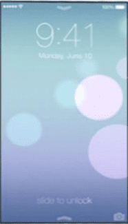
It begins when you unlock the phone, which is now via a swipe up, rather than the old Slide to Unlock bar.
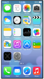
Of course then users will be confronted by Apple’s square grid of now flat icons, which now look even worse and more cluttered for being a kaleidoscope of coloured bits on the screen. That was definitely not copied (very well at least) from Windows Phone.
The flat icons float on a 3D surface reminiscent of the worst of Android skins, and shares the space with clashing gradients and translucent effects. We can certainly see Jonny Ive’s excess of user interface experience at play here.
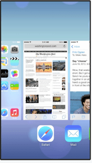
That multi-tasking screen in the middle does however certainly look somewhat familiar, and while some may say it comes from webOS, I think as a contemporaneous OS Windows Phone is much more likely to be Apple’s muse.
 |
 |
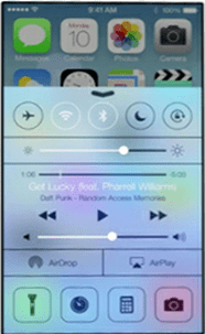 |
And where did I see that SMS screen before? But really Apple, 3 different styles of buttons on one screen?
Another thing that will be familiar to Windows Phone users in Bing search results, now the default source for Siri queries.
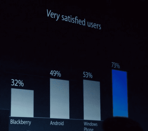
While I am sure Windows Phone users would love the wealth of features on iOS 7, even Apple acknowledged that Windows Phone was their closest competitor for satisfying users. No wonder they decided to copy our OS while trying to improve theirs.




User forum
0 messages