Microsoft Teams gets a touch of Fluent Design
1 min. read
Published on
Read our disclosure page to find out how can you help MSPoweruser sustain the editorial team Read more
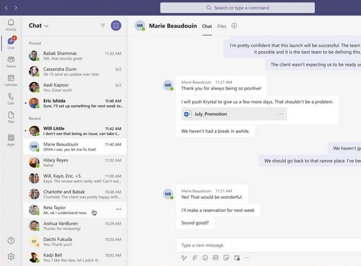
Besides adding a huge list of features, Microsoft is also working on improving the look and feel of the Microsoft Teams app for Windows 10.
The company has updated the UI of the web version of the app with new Fluent Design cues for testers, with the final version expected to be released in December. All going well the native client will have a similar update in 2021.
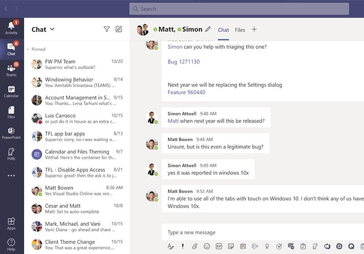
The (somewhat subtle) improvements are best appreciated compared to the old version (below).
Compare to that, the new version (below) has subtle shadow effects, rounded corners, less saturated colours and drop shadow effects on the text.
Microsoft is also believed to be working on a new Dark Mode, but have not shared screenshots yet.
Besides the improved UI, the November update is also expected to bring improved messaging, notification features, and new meeting options.
via WindowsLatest





User forum
0 messages