Microsoft Program Manager asks developers to implement rounded corners in Windows 10 UI controls
2 min. read
Published on
Read our disclosure page to find out how can you help MSPoweruser sustain the editorial team Read more

In May we heard a rumour that Microsoft is planning to abandon the sharp corners of the current fluent design in Windows 10 and adopt the more common rounded corners seen in iOS and Android.
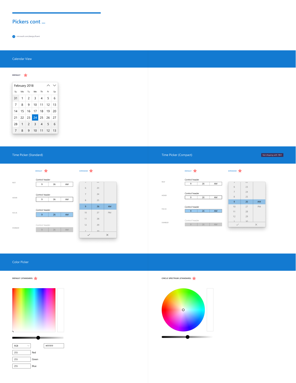
Today we have confirmation, via a Github post by Sravya Vishnubhatla, Program Manager in Microsoft’s Windows Fluent Design team, who asked developers to implement rounded corners in their Windows 10 controls, and also posted a number of examples of what such controls would look like.
Posting on GitHub she posted a proposal saying:
“Update default control styles with rounded corners and make them easy to customize. Developers should not have to retemplate the controls to “unround” the corners or round them further.”
She explains the problem, saying:
XAML controls are inconsistent with how web and mobile apps are evolving – this highlights the inconsistency across app ecosystem on Windows when these UI are used intermixed with each other.
There are many different levels of corner rounding in the market today but the way XAML controls are architected require those developers who wants to update to retemplate all the controls, locking them to a version of the control that will not be able to take advantage of future updates as easily.
She also posted mock-ups of what they expect the controls to look like:
Microsoft is inviting those who are unhappy with the proposal to comment on Reddit here.
What do our readers think of the new look? Let us know below.
Via WindowsLatest.





User forum
0 messages