Microsoft's LinkedIn announces its first major visual redesign in five years
2 min. read
Published on
Read our disclosure page to find out how can you help MSPoweruser sustain the editorial team Read more
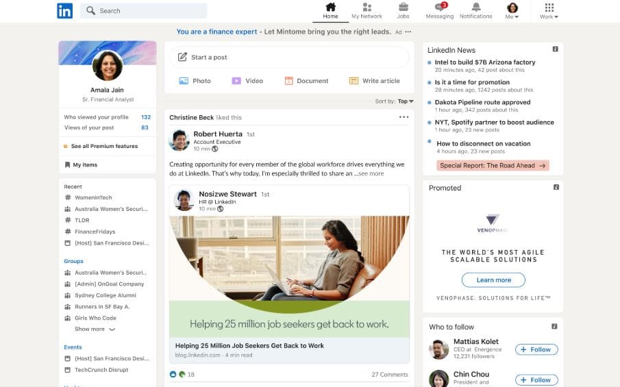
Microsoft LinkedIn yesterday announced the first major visual redesign in five years. This redesigned LinkedIn experience will deliver cleaner, more modern look and also improve the user experience. LinkedIn design team listed the following as the design changes:
- Warmth: We’ve infused a warm color palette with foundational canvas hues, and blue and green accents to signal action and selection. We’ve also added more rounded shapes and buttons in our user interface for a softer, friendlier experience.
- Intuitive: The new design optimizes for space, size, and typographic structure, and has less of that traditional “LinkedIn blue”, so it’s less about us and puts more focus on you. This allows us to save the blue color to be a clear affordance to take action, making it clearer how to navigate and use the app.
- Simple: We’ve streamlined the look and feel, adding more whitespace, and reducing divider lines and decorative icons.
- Inclusive: This new experience was designed to meet accessibility standards with layout decisions and elements that allow for text scaling, bigger touch targets, and emphasize contrast for readability. And, we have plans to introduce a dark mode soon. We also developed new illustrations that capture a wide range of different professional fields and industries beyond tech, and represent people with different abilities and ethnic backgrounds, bringing to life our vibrant community and the diverse perspectives that exist on LinkedIn.
This new redesigned LinkedIn experience is rolling out to members globally over the next few months. In the coming months, LinkedIn will bring more improvements, including a dark mode option.
Source: LinkedIn



User forum
0 messages