Microsoft Launcher updated with new transparency options
1 min. read
Published on
Read our disclosure page to find out how can you help MSPoweruser sustain the editorial team Read more

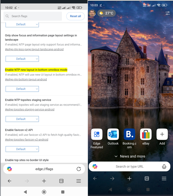
Microsoft has today released a new update for the Microsoft Launcher on the Google Play Store. Microsoft Launcher was previously known as Arrow Launcher, but the company recently rebranded it and added some new features. The change also included a new design inspired by the company’s Fluent Design.
And today’s update adds a neat new option to the app. Along with the usual dark and light themes, Microsoft Launcher has a transparent theme that looks a lot like the Acrylic (blur) effect form Fluent Design. With today’s update, users can now control the opacity of the transparent theme, and they can even control the amount of blur behind the cards/elements on the launcher. It’s a lot like the way you can control the transparency of tiles on the Windows 10 Mobile Start Screen.
Microsoft has also included the traditional bug fixes, performance improvements and other minor changes with today’s update. You can grab it from the Google Play Store here.
via: Windows Central


User forum
0 messages