Microsoft explains why the Modern Disk Management page in Windows 10 Settings is better
2 min. read
Updated on
Read our disclosure page to find out how can you help MSPoweruser sustain the editorial team Read more

Microsoft is slowly replacing the modules in the Windows 10 Control Panel with pages in the Settings app in Windows 10.
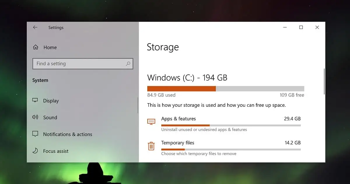
The most recent module to be upgraded is the Disk Management page in Windows 10, which was introduced with Build 20197 in August.
Then Microsoft said:
We mentioned we had more Settings work on the way, and here’s the next one – as of today’s build you’ll now be able to manage your disks and volumes from within the Settings app. This includes tasks such as viewing disk information, creating and formatting volumes, and assigning drive letters.
Unlike the existing Disk Management MMC snap-in, this modern experience was built from the ground up to with accessibility in mind. It also features better integration with features such as Storage Spaces and the Storage breakdown page.
Now on the Windows Insider podcast Microsoft revealed more about the feature.
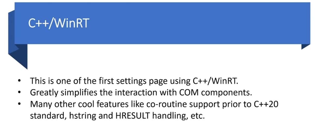
Microsoft revealed that it is the first Settings page which uses a combination of C++ and WinRT which greatly simplified the interactions with COM (Component Object Model) components within the new modern UI.
They also report that the page reacted in real-time to changes to the file system, unlike the old applet, for example showing instantly when you attach a USB Drive.
“The update mechanism is undocked from the UI thread. Then, the UI fetches information using a non-blocking synchronization mechanism,” Microsoft said.
Unlike the older applet, the page is also fully accessible via the keyboard and supports Windows Narrator.
“One of the main goals of this project was to provide an accessible interface for managing device storage”, Microsoft noted.
The new page is still pretty sparse and feature-poor, so there is still quite a lot of work to do.
via Windows Latest


User forum
0 messages