Groove Music app gets more Fluent Design in latest update
1 min. read
Published on
Read our disclosure page to find out how can you help MSPoweruser sustain the editorial team Read more

Despite no longer being supported by a streaming music service or even allowing you to buy music, the Groove Music Player is still the native music playback app on Windows 10, and I suspect to the surprise of many Microsoft has continued to push out updates to the app.
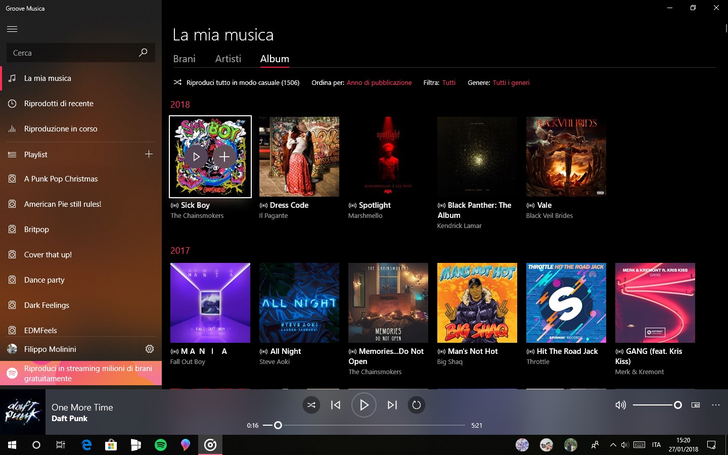
A new update has just arrived for Insiders on the Fast Ring which brings significant changes to the design of the app, in particular, the Playback bar.
The Playback bar is now slightly translucent in line with Fluent Design, higher and the playback controls are now above the timeline, as can be seen in the screen shot above. The old design can be seen below:
The update is rolling out now and will presumably come to regular Windows 10 users in a few weeks.
Find the app in the Windows Store here.
[appbox windowsstore 9wzdncrfj3pt]
Screenshot and story via WBI


User forum
0 messages