Google is testing a new UI for Chrome’s new tab page
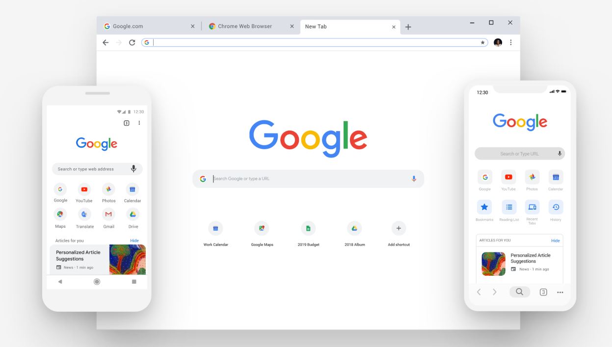
In an effort to revamp Chrome’s new tab page UI, Google is working towards introducing a new UI for Chrome’s new tab page. The Android maker has already started testing the new tab page UI for Chrome on Android.

As you can see in the above image, most of the UI elements, which includes the Google logo, links to your favorite and recently visited web pages, have been moved up. Another important change that you’ll notice is the Google icon is now smaller than that of the previous UI, or should I say the current UI. The search bar is now a bit closer to the Google icon.

Tab organization is also an important change. Instead of suggesting articles, Google will use the rest of the empty space towards the bottom to let you group tabs together. Switching to Incognito mode is also very simple — the incognito option now appears on the right side of the Google icon.
The new tab page UI is available for those who are running Chrome Canary v81.0.3991.0. To test the new UI, all you have to do is go to chrome://flags and turn on the enable-duet-tabstrip-integration flag.
Read our disclosure page to find out how can you help MSPoweruser sustain the editorial team Read more
User forum
0 messages