Google Drive's new video player drifts away from its YouTube-like red look
The update is launching soon to everyone.
1 min. read
Published on
Read our disclosure page to find out how can you help MSPoweruser sustain the editorial team Read more
Key notes
- Google Drive is revamping the look of its video player, tapping Material 3.
- Shifting away from YouTube-like red look, it now features white color for its components.
- It may take a while for the look to arrive to everyone, though.
Google has now redesigned the video player on Google Drive, tapping a modernized design that aligns with Material Design 3.
The updated player features a Material 3 slider with a vertical line handle, a large play/pause button, and intuitive fast-forward and rewind controls that allow for precise navigation. And now, instead of red that kind of resembles YouTube, we’re getting all-white look for these components.
Here’s the comparison, this is before:
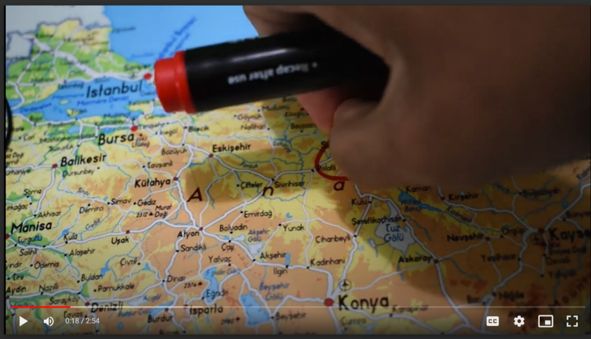
And this is after:

It does look nicer, refreshed, and rejuvenated indeed, but it’s going to take a while to be visible to everyone. Google says that this will be available to all Google Workspace customers, and it’s also coming to the upcoming AI-powered Google Vids video-editing platform.
Google’s Material 3 is the tech giant’s latest open-source design system, which supports Jetpack Compose for building Android apps. It’s known for its dynamic color features that let apps change their color schemes based on user preferences.

User forum
0 messages