Animation shows how the Nokia Moonraker smart watch was meant to work (video)
2 min. read
Published on
Read our disclosure page to find out how can you help MSPoweruser sustain the editorial team Read more
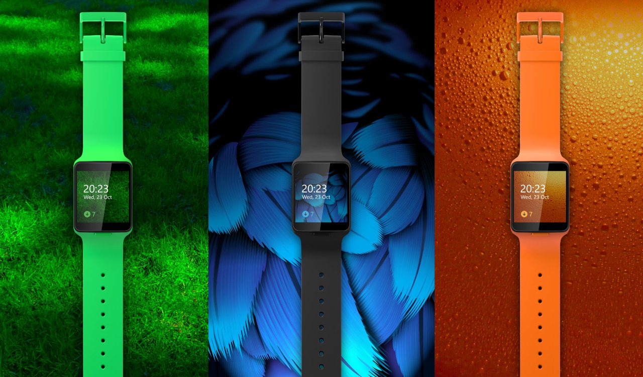

While the Microsoft Band is the main wearable accessory for Windows Phone users, there was once meant to be another device by Nokia, codenamed Moonraker. The device was ultimately cancelled before coming to market witht the sale of Nokia’s handset division to Microsoft, and now lives on in the realm of what could have been.
Yesterday Core on Twitter however tweeted an animation from what we assume is a tutorial from a Windows Phone 8.1 app showing how the device was meant to function.
The animation demonstrates the swipe-based user interface with swipes from the top and the bottom revealing apps and notifications, a physical button for switching between the home and standby screen, and a long press on the screen (which I think is just about as good as Apple’s force touch) for displaying the latest notifications when in standby mode. Users would also be able to select which apps they receive notifications from.
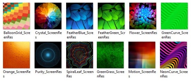
The watch would have come with a market place for apps, and a number of wallpapers and configurable watch faces in the box.
The smart watch looks like it would have been reasonably viable, though it did not include much fitness tracking features in the original design, a major attraction for the current generation of devices. There appears to be no indication at present that Microsoft will release another smart watch, but the company is slowly expanding the capabilities of the Microsoft Band, and hopefully the Band 3 will surprise us with even more features.
Read more about the ultimately doomed Moonraker here with photos of the device available here.






User forum
17 messages