Chrome's new tab page might be getting a makeover: visible Edge similarities
![]() 1 min. read
1 min. read
![]() Published on
Published on
Share this article

Improve this guide
Read our disclosure page to find out how can you help MSPoweruser sustain the editorial team Read more
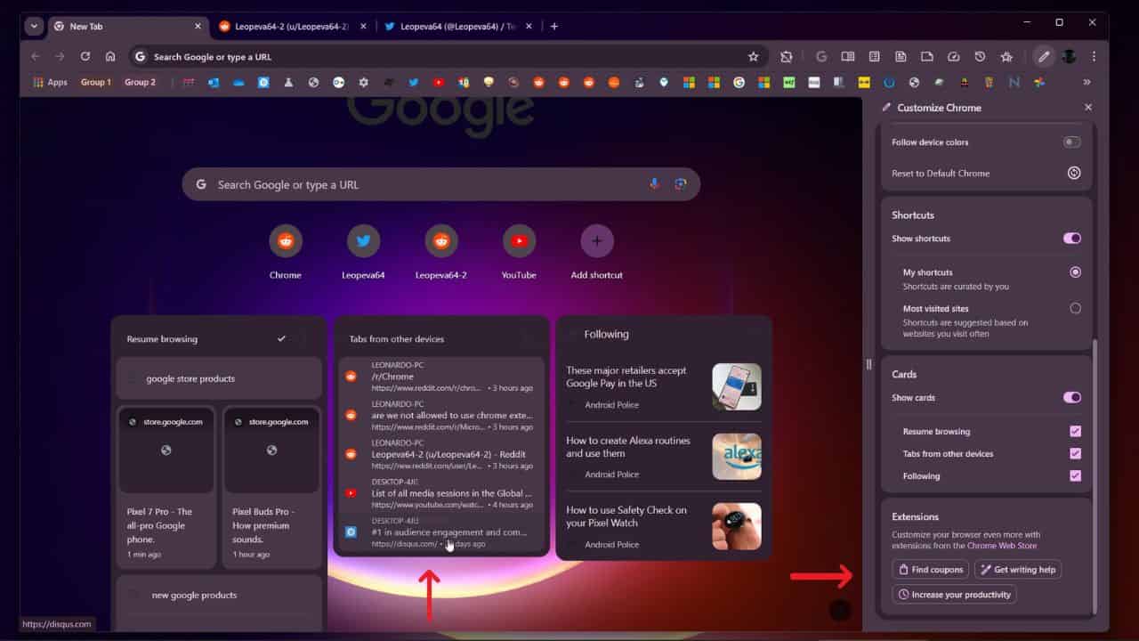
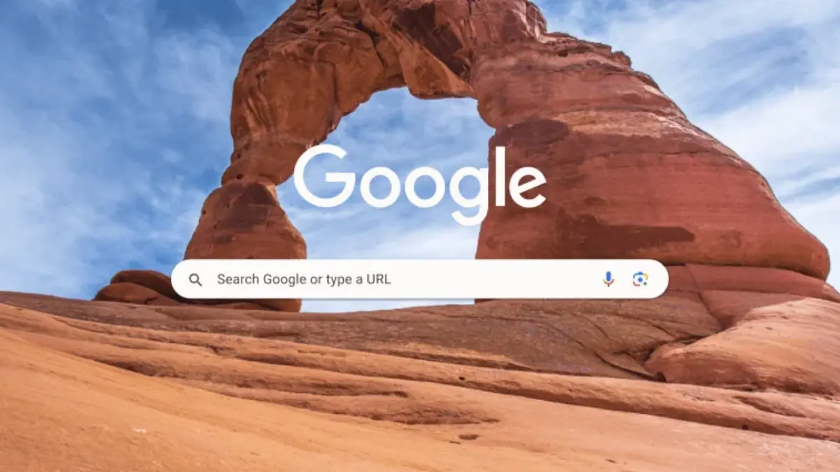
Google is proposing changes to Chrome‘s New Tab page. The new design features a “module” system, allowing users to add optional components like tabs from other devices and extension shortcuts. Additionally, Google promotes extensions through a new “Extensions” card in the customization panel.
While I appreciate the added functionality and customization options, others are concerned that the new design is becoming too cluttered and similar to Microsoft Edge. One user tweeted, “Why does this look like the home page of the Microsoft Edge browser? I thought the minimalist design of chrome was its power, but this!!”
However, it’s been pointed out that the modules are optional and can be disabled for a cleaner look.
These modules are optional and do not appear by default, in the screenshot you can see the checkboxes to enable them, you can configure the NTP so that only the search box and the Google logo appear, in Edge you can do the same.
— Leopeva64 (@Leopeva64) December 3, 2023
The debate highlights the delicate balance between adding useful features and maintaining a clean and familiar design. It’s unclear how Google will respond to this feedback. Still, they’ll need to carefully consider user preferences to ensure the new Chrome experience remains positive for everyone.
What do you think about the proposed changes? Do you find them helpful or clutter the New Tab page? Share your thoughts in the comments below.