A close look at the Contacts and Calendar app in Windows 10 Mobile
![]() 5 min. read
5 min. read
![]() Published on
Published on
Share this article

Improve this guide
Read our disclosure page to find out how can you help MSPoweruser sustain the editorial team Read more

Microsoft is still developing Windows 10, but they have already shown off some designs which explain their vision for the OS, both on phone and desktop.
Windows fan Tisch on the Verge forums have posted a close look at two still unreleased Windows 10 apps, the Contacts (or People) app and the Calendar app.
 |
 |
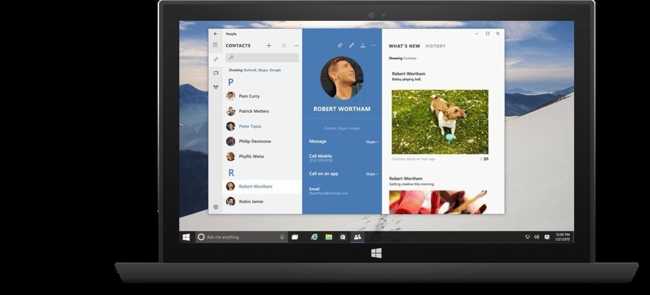
Windows 10 Universal apps will have a responsive user interface which changes based on the width of the screen and the device it is being displayed on. Above we can see how the desktop People app changes from a 3 panel interface to separate screens when moving to the phone.
Tisch writes:
PEOPLE
The most interesting thing about this app design is the use of a combination of pivots and hamburger menus. They explained it in detail during the presentation, here’s how it works: When viewing a contact, there are three sections: profile, what’s new and history. On the desktop these sections are displayed next to each other (with the history section being hidden away within the what’s new section, for whatever reason), on phones these sections are implemented as pivots to swipe through horizontally, very similar to current Windows Phone UIs. The hamburger menu (with the hamburger button located at the top left corner, sadly) contains settings and other menus, and also access to the contact list which is displayed within the hamburger menu UI. On the desktop the hamburger menu is expanded by default, showing the contact list by default. I wonder if hiding the contact list away in the hamburger menu on phones is a good idea.
Additionally the app has app bars that are very similar to those in current Windows Phone apps. They contain icons for actions such as pinning or editing as well as ellipsis buttons (“…”) to access additional options. Both the main UI and also the hamburger menu have app bars. On the phone these app bars are on the bottom. On the desktop they are on the top, but not as actual bars that go along the complete top edge of the window, but as collections of buttons on the top of the sections/menus.
Features
There’s nothing surprising here, very similar to the current apps. The only thing that stands out is the ability to choose default apps for messaging and calling on a per contact basis.
Visual design
Similarly to the new login screen and the Xbox app on Windows 10, this app also uses circular profile images instead of square ones.
The app uses a light theme and a blue accent color, which might either be the theme for all the Outlook related apps, or it adjusts to the individual system theme, which I personally would prefer.
I like how the app implements the principle of using font size to create a clear hierarchy in the UI, which is one of my favorite original Metro design principles.
The title bar of the window on the desktop is visually integrated with the app UI, which looks pretty nice.
Naming
I think it’s worth noting that they called the app “People Hub” during the presentation, considering that Microsoft moved away from using the term and the concept of hubs on Windows Phone. The title bar of the app just says “People”, which I assume will be the name of the app. There’s no hint of “Outlook” being part of the app name, even though the app is said to be developed by the Outlook team, along with the Calendar and Mail apps.
The Calendar app, also not seen on actual devices yet, features a similar transformation from desktop to phone, but it appears with some loss of features and options as a result.

Tisch notes:
Calendar and Mail combined
Although they didn’t mention this during the presentation, the calendar app in Windows 10 seems to be combined with the mail app – at least on the desktop. The desktop version has a UI in the bottom left corner that lets you switch between the calendar and the mail part of the app (we’ve already seen this in an early Mail app design), and the title bar says “Mail”, not “Calendar”. My guess is that Microsoft wants this app to be perceived as a light version of Outlook. The phone UI doesn’t seem to have mail functionality integrated (although it could be hidden in the hamburger menu, which I highly doubt). Maybe the phone will have two separate apps for Calendar and Mail, while those two apps will be combined in one package on the desktop to make it more like Outlook.
Again, this app doesn’t seem to have the Outlook branding.
UI
They showed this as an example of how an app can have two completely different UIs for phone and desktop to create the best possible experiences for both form factors.
They didn’t discuss these UIs in much detail, and they look pretty standard. The phone version has less viewing options than the desktop version (a monthly grid view, and a “today” view). In the grid view, there’s a colored bar on the background of each day that seems to provide glancable information on how many appointments are made for each day. Tapping on a day reduces the grid view to a week, with the selected day being displayed in detail below.
Visual design
Again, white theme and blue accent color. I hope this will adapt to the individual system theme.
In many ways it seems Microsoft has gone from a cohesive and coherent design language into a confusion of old and new controls which often do not make sense, despite looking quite good. Many have blamed the “failure” of Windows 8 on trying to force a tablet user interface into desktop computers, but it seems to me that in this case the opposite is happening, with Windows Phone likely to suffer greatly.
What do our readers think?