This was Microsoft's 2009 vision of computing in 2019
![]() 2 min. read
2 min. read
![]() Published on
Published on
Share this article

Improve this guide
Read our disclosure page to find out how can you help MSPoweruser sustain the editorial team Read more
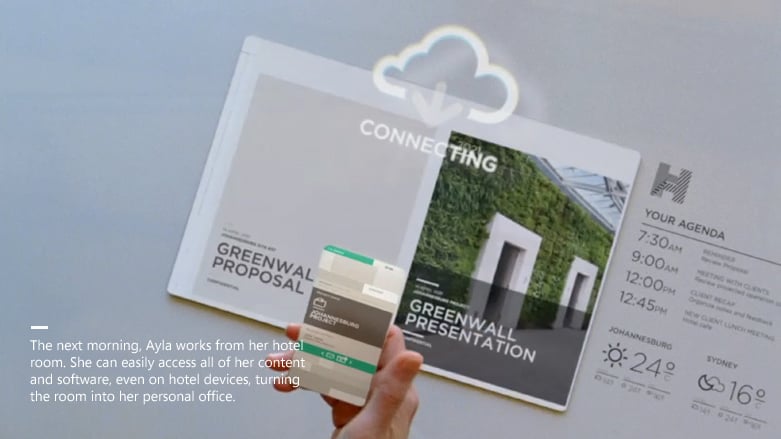
Way back in 2009 Microsoft posted their vision of productivity in the future. It featured elements such as collaboration through large screens, voice-activated digital assistants, smart mobile and IoT devices, instant translation and drag and drop from phones to PCs and tablets and back.
In some aspects, Microsoft’s prediction of the future has been pretty accurate. In 2019 we will have near bezel-less smartphones and we will have giant screens which can be used in a classroom and enterprise setting, and we even have coffee cups connected to the internet.
What we do not have however is the new user interface which ties all these computing surfaces together. We have not been failed by the hardware engineers but by the user interface designers. It appears time after time it has been easier to mock up a stylish, attractive and superficially usable UI which in the final product still ends up being a row of icons and a list of menu items.
The issue is not unique to Microsoft. We have seen many companies attempt to redesign the smartphone and PC user interface, and in the end settling into the same old mould of more of the same. While 2019 will bring flexible and transparent screens, it seems very likely we will still be displaying windows with 1-pixel borders on them.
Do our readers think we will be forever stuck with WIMP (windows, icons, menus and (mouse) pointers)? Let us know below.